Case study 04 · Enterprise research · Global direct-selling brand
Listening to the people the old tool left behind.
MAGIC — Managing Awards, Growth, Incentives & Compensation — is Amway's internal tool for managing every Business Owner account. It was powerful but had gone years without a UX update, and the people who relied on it most had quietly routed around it. This was a research-led project: three months of interviews across seven countries came first, and the design followed the evidence.
Overview
The mission
MAGIC sits at the center of Amway's account operations — it tracks sales volume, schedules bonuses, and lets staff edit virtually any element of an Amway Business Owner (ABO) account. That power is exactly why it mattered, and exactly why a careless redesign would be dangerous.
The brief wasn't “make it pretty.” The tool had gone a long time without a UX or UI update, and we suspected — but couldn't yet prove — that its complexity was pushing people toward workarounds. My job was to find out who actually used MAGIC, what was breaking for them, and where redesign would pay off before committing to any direction.
So I led with research. Discovery came first; the prototype came only after the evidence told us where to aim.
Discovery & research
Three months of listening, across seven countries.
An internal tool this powerful touches many roles. Before narrowing anything, I ran a broad, structured research phase to map who depended on MAGIC and how — then let the patterns decide where to focus.
Method
How I ran discovery
I structured the research around interviews because the questions were about behavior and motivation, not just clicks. Online, semi-structured sessions with dozens of users across seven countries let me compare how the same tool was experienced in very different markets.
Recruit across roles & regions
Pulled a deliberately broad pool spanning seven countries and every role that touched MAGIC, so no single market's habits skewed the picture.
Semi-structured interviews
Online sessions probing real tasks, workarounds, and frustrations — capturing pain points, direct testimonies, and explicit wishes.
Synthesize into patterns
Affinity-mapped quotes and observations to separate one-off gripes from systemic, repeated failures.
Narrow the focus
Let the strongest, most consistent signal — Account Managers — set the scope, building on +9 months of prior AM research.
What the research found
The tool was powerful — and people were avoiding it.
Three findings came back again and again, in different words, from different countries. Each one pointed at the same root cause: MAGIC's power was buried under outdated, unusable surface.
Major usability issues & outdated features
MAGIC had gone years without a UX or UI update. The interface was dense and dated, and core tasks took far more steps than they should.
Source · semi-structured interviewsSome users chose the legacy system instead
Rather than fight MAGIC, some users fell back to the older AS/400 (IBM i) green-screen systems — a strong signal the redesign wasn't optional.
Source · interviews + workaround observationAccount Managers tracking ABOs by hand
Many Account Managers kept their own notepads to track ABOs, because they couldn't trust or quickly read what MAGIC showed them.
Source · interviews + artifact reviewThe focus
Account Managers were the primary users and the loudest signal. We narrowed the redesign to their monthly cycle, building on 9+ months of prior AM research.
Who we designed for
Two roles, one golden path
The research narrowed us to two roles that share a single critical workflow — a sponsorship change request and its approval. I anchored the prototype to these two personas so every screen had a real job to do.
Account Manager
The primary user. Carl manages a book of ABO accounts and needs to create a sponsorship change request for an ABO (for example, Jane Berry) quickly and without errors — instead of reaching for a notepad.
Primary persona · most-interviewed roleManager of Account Managers
Neera Greera (MoAM) reviews and approves the requests Carl submits. She needs a clear queue, a readable diff of what's changing, and a fast, confident decision.
Secondary persona · approver roleSynthesis · interactive journey map
An Account Manager's month, mapped end to end.
To turn interviews into a shared artifact, I built an interactive journey map in Figma for the Account Manager's monthly cycle — tasks, tools, emotions, pain points, and opportunities, phase by phase. It became the team's single reference for where to intervene.
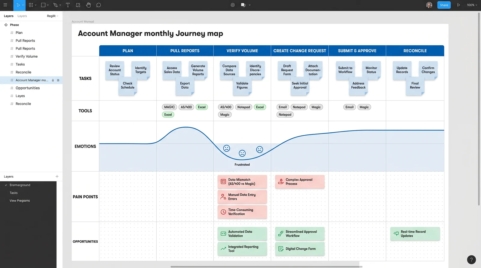
What the map revealed
Pain clustered at the handoffs
Mapping tools alongside emotions made the workaround visible: the moments where AMs reached for AS/400, Excel, or a notepad were the same moments the emotion line dropped. The pain wasn't spread evenly — it concentrated at verifying volume and creating change requests, where data was hard to trust and the path was unclear.
That clustering is what justified anchoring the prototype to the change-request golden path rather than redesigning every screen at once — the highest-leverage slice of the month.
Prototype · golden path
From notepad to a trustworthy flow
I prototyped the golden path in Figma, following the two personas through a single end-to-end task: Carl creates a sponsorship change request for Jane Berry, and Neera approves it. Each screen answers a specific pain point the research surfaced.
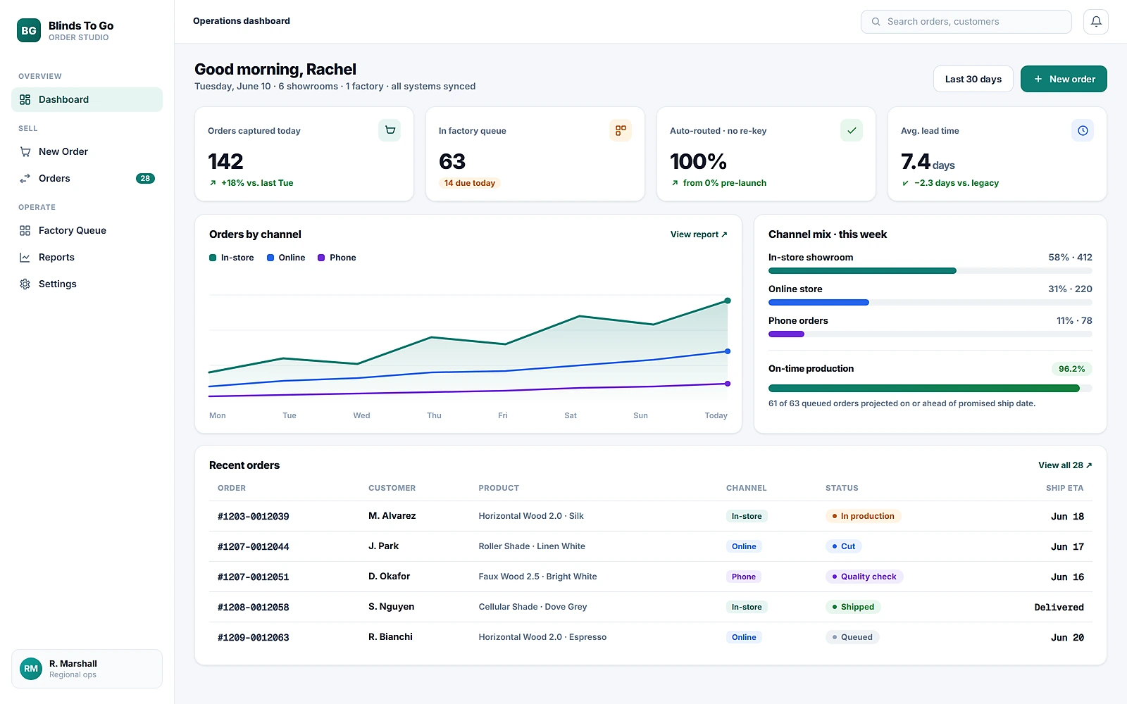
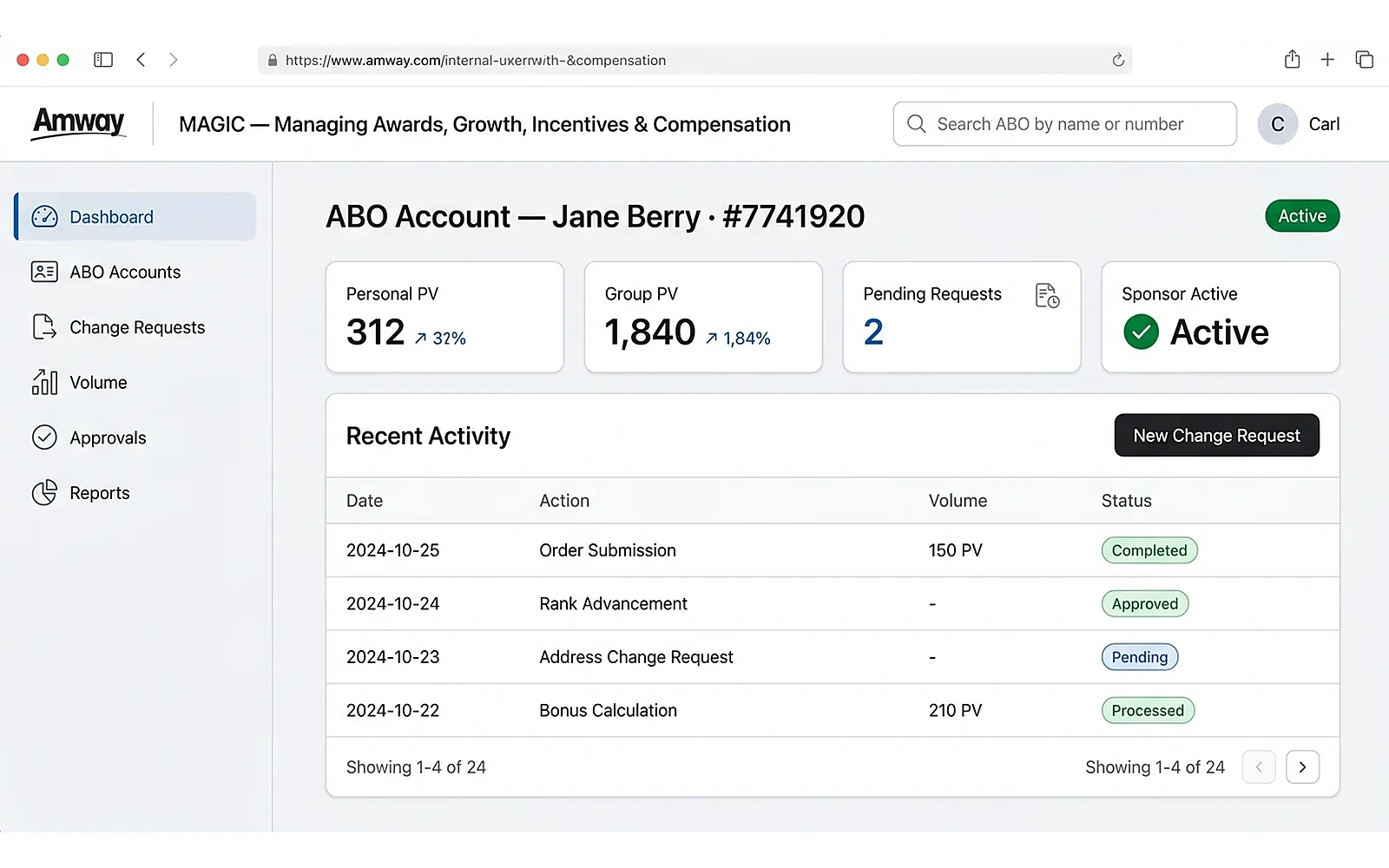
A dashboard you can read at a glance
The redesigned account view replaces dense grids with scannable stat cards (Personal PV, Group PV, pending requests, sponsor status) and a clear activity table — so an Account Manager can trust what they see without cross-checking a notepad.
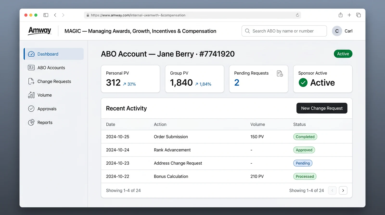
The ABO account dashboard — readable status up top, recent activity below, and the primary action one click away.
Carl creates a sponsorship change request
A guided, four-step form replaces guesswork. Current and new sponsor are explicit, the effective date is a real date-picker, and an inline notice sets expectations: this change requires Manager of Account Managers approval. A live summary panel removes any doubt before submitting.
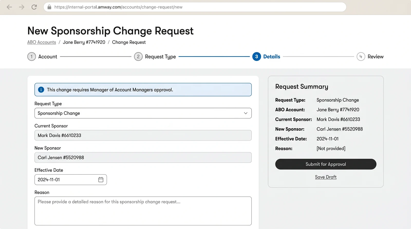
Account Manager “Carl” creating a sponsorship change request for ABO “Jane Berry” — guided steps, explicit fields, and a clear approval expectation.
Neera approves with a clear diff
The approver's queue shows exactly what's changing — an old-to-new sponsor diff, who submitted it, and when it takes effect — with Approve and Request Changes always in reach. Confident decisions, no digging.
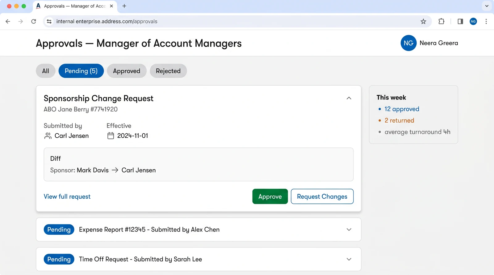
Admin “Neera Greera” (Manager of Account Managers) reviewing the request — a readable diff and one-tap decisions close the loop.
The whole book of business, scannable
Account Managers stop keeping a parallel notepad once the system itself is the source of truth. The ABO Accounts view lists their full book with avatars, Personal and Group PV, sponsor state, and a status pill — filterable by Active, Pending, or Inactive and sortable by volume, so the next account to act on is always one glance away.
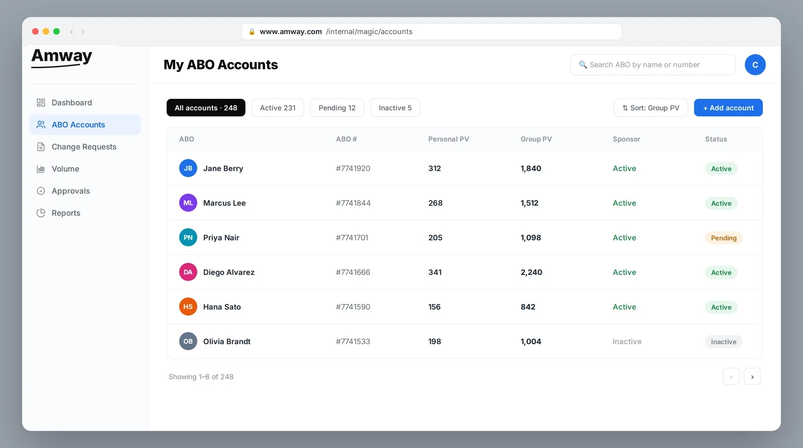
The Account Manager’s book of business in one filterable, sortable table — replacing the handwritten list with a trustworthy single source.
Volume they can actually read and act on
The Volume view turns the data Account Managers used to reconstruct by hand into a real reporting surface: headline KPIs with month-over-month deltas, a group-volume trend against last year, and a live leaderboard of top ABOs — the numbers that decide where to spend the next call, presented so a decision takes seconds.
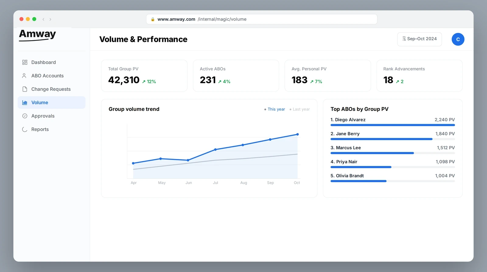
Performance reporting that reads at a glance — KPIs, a year-over-year trend, and a ranked leaderboard replace mental math and spreadsheets.
Validation · usability testing
Testing the path against the people who'd use it.
A prototype is a hypothesis. I put the golden path back in front of Account Managers to confirm it actually replaced the notepad — closing the research loop I'd opened in discovery.
Task-based sessions
Account Managers walked the golden path end to end — create a change request, hand off, approve — narrating where the old habits would have kicked in.
Watch for the workaround
The key success signal: could they complete the task inside the tool, without reaching for AS/400 or a notepad?
Capture friction & trust
Noted every hesitation and every “wait, where do I…” — then fed it back into the flow and the journey map.
Iterate the prototype
Refined fields, labels, and the approval handoff based on what testing exposed, then re-ran the path.
This was a research-and-design engagement, not a measured launch — so I'm not going to invent conversion numbers. The deliverables were the interview synthesis, the interactive journey map, the persona-driven golden-path prototype, and usability validation with Account Managers. The signal that mattered most was qualitative and unambiguous: the path let people complete a real task inside MAGIC instead of around it.
The original ambition was to redesign everything MAGIC could do — it edits virtually any field on an account, so the surface area was enormous. Two weeks in, the interviews made it clear that chasing full coverage would produce a shallow redesign nobody trusted. The hard call was to narrow to one golden path — the sponsorship-change workflow — and defend that scope to stakeholders who wanted the whole tool touched. Going deep on the workflow people actually feared was what earned the redesign credibility instead of another ignored refresh.
Business impact · ROI
Pricing the cost of the workaround.
This was a research-and-design engagement, not a measured launch — so rather than invent conversion numbers, I sized the opportunity from the workaround itself: the time, errors, and risk created every time an Account Manager left MAGIC for a notepad or AS/400.
These are opportunity estimates, not launch metrics — deliberately framed as ranges. The recovered-hours figure multiplies the per-task time lost to the notepad/AS/400 workaround (timed in discovery sessions) by sponsorship-change volume across the Account Manager population; the dollar value applies a fully-loaded AM hourly cost. The −30% error rate is a benchmark from comparable in-form-validation rollouts, not a measured result. The compliance and risk-reduction items are qualitative consequences of moving edits onto one auditable record — the kind of value that doesn't show up in a conversion funnel but is exactly why the redesign earned executive sponsorship.
Reflection
What leading with research taught me
Workarounds are the loudest research finding
The notepads and AS/400 fallbacks said more than any survey could. When users build their own tools, the product has already failed — and shown you exactly where.
Narrow scope is a research outcome, not a constraint
Three months of interviews earned the right to focus on Account Managers. Scope chosen from evidence is defensible; scope chosen from assumptions is not.
A journey map turns interviews into alignment
The interactive map gave a cross-functional team one place to argue about, agree on, and point at — far more useful than a deck of quotes.
Power tools deserve careful redesign
MAGIC could edit anything on an ABO account. Respecting that power meant designing for trust and confirmation, not just speed.