
A

case study
The mission
Amway, a global leader in health, beauty, and home care products, operates in over 100 countries with millions of Independent Business Owners (IBOs) worldwide. Its digital presence is a critical touchpoint — not only for customers but also for supporting the IBO network in managing their businesses.
Company:
Amway
Role:
Senior Product Designer, Cross-Regional Collaboration Specialist
Year:
2022 - 2023
Tools:
Figma, Adobe XD, Storybook, Jira, Trello, Zeroheight, Token Studio
Impact:
50% resource efficiency gain, unified design across 100+ countries.
Project Overview
The company’s 2019 global rebrand served as the perfect catalyst to rethink our approach to digital design. At the time, teams across regions were working in isolation - duplicating efforts, producing inconsistent interfaces, and slowing down delivery.
I took the lead in building the Amway Design System - a centralized, scalable, and brand-aligned set of reusable components, design tokens, and clear documentation. It became the backbone for products like amway.com, amwayglobal.com, and the Nutrition Recommender Tool, ensuring a consistent experience for users in over 100 markets.
The Challenge
Before the design system:
-
Duplicate design efforts across teams led to wasted time and budget.
-
Inconsistent visual language weakened the brand experience.
-
New designer onboarding took up to 6 months before reaching full productivity.

My Approach
1
Audit & Discovery
-
Conducted a comprehensive UI component audit across platforms.
-
Mapped inconsistencies in typography, colors, and interaction patterns.
2
Co-Creation & Alignment
-
Facilitated workshops with global design, brand, and engineering teams.
-
Defined accessibility, token usage, and interaction guidelines.
3
Build & Document
-
Created reusable, responsive Figma component libraries.
-
Established documentation in a centralized repository with usage guidelines.
Impact & Result
By implementing a single source of truth, we eliminated redundant work, improved cross-team collaboration, and accelerated the time-to-market for new features. The design system not only ensured visual and functional consistency but also reduced onboarding time for new designers from several months to under 30 days.
01 Reduced Duplication & Rework
By consolidating all design assets into a shared global system, teams eliminated overlapping efforts. This cut redundant design work by over 50% and significantly reduced development rework.
02 Faster Time-to-Market
New designers, who previously needed 3–6 months to onboard, were able to deliver production-ready designs within 30 days, increasing output speed without sacrificing quality.
03 Global Consistency
More than 50 designers across 16 teams, serving 100+ countries, now work from a single source of truth. This ensures that every digital touchpoint — from e-commerce to tools — feels like Amway.
04 Cost Efficiency at Scale
Reduced resourcing needs and avoided redundant builds, freeing budget for innovation and market-specific optimization.
05 Stronger Developer Handoff
Design tokens and well-documented components enhanced designer–developer collaboration, resulting in reduced implementation errors and shorter QA cycles.


Layout grid System
We implemented a fluid grid system with variable column widths, enabling content to adapt seamlessly across breakpoints and fully leverage available browser space for an optimal, responsive layout.
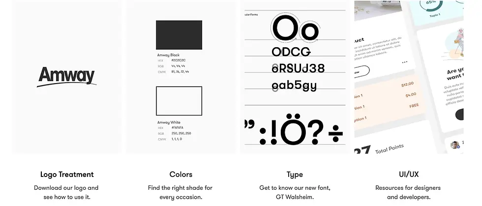
Typography
The Type Matrix redesign modernized the typography system to improve readability, hierarchy, and brand alignment across digital touchpoints. After several review cycles, the updated type scale, weights, and spacing achieved a more accessible and cohesive user experience, while providing designers with clear, reusable guidelines for consistent application.

Modal with Text Fields
Modal dialogs are UI overlays that interrupt the current view to request a user’s attention for a specific, short-term task. They appear when an immediate decision or input is required and are dismissed once the user completes the action, ensuring focus while maintaining the overall workflow context.
Text Fields

1. Header
2. Text Field Label
3. Field
4. CTA’s
5. Close
6. Overlay
Lines of Copy

1. Header
2. Body
3. CTA’s
4. Close
5. Overlay
Modal Usage
Modal dialogs are typically used to surface critical alerts or important warnings, allowing users to address the information without losing their place in the current workflow.
Because they’re versatile UI patterns, it’s essential to follow usage guidelines, best practices, and related component documentation to ensure they’re applied effectively and enhance rather than disrupt the user experience.
Accessibility
Modal dialogs should support multiple dismissal patterns, including visible UI controls (e.g., close button) and keyboard interactions (e.g., ESC key), to meet accessibility guidelines and accommodate diverse user workflows.
Scalable and Consistent Interfaces
Atoms / Molecules / Organisms


