Case study 02 · Enterprise checkout · Global direct-selling brand
A hybrid checkout reimagined for two audiences at once.
A global direct-selling brand's checkout had to serve everyday shoppers and Business Owners through the same flow. I treated it as a systems problem first — piloting the rebuild on the Italy market, then rebuilding the foundational flow on a shared model with guest checkout, payment-failure recovery, and a component library that rolled out from that pilot to 6 markets.
Overview
The mission
Amway is a global leader in health, beauty, and home care, operating in over 100 countries with millions of Independent Business Owners. Its digital storefront is critical — not only for everyday shoppers, but for the business owners who run their livelihoods on the platform.
The Italy platform supports a hybrid commerce model serving both retail customers and Amway Business Owners (ABOs). That dual audience makes checkout uniquely demanding — it has to carry multi-level pricing, regional PV/BV constraints, a spread of payment methods, and per-market legal compliance, all without overwhelming a first-time shopper.
I approached it as a systems problem first and a screen problem second: map how checkout actually behaved across markets, then rebuild the foundational flow on top of that shared model.
Discovery & research
I mapped two audiences before I drew a single screen.
A hybrid checkout fails quietly when you design for an average user who doesn't exist. I ran a mixed-method discovery to separate what retail shoppers needed from what Amway Business Owners needed — and where the same flow was punishing both.
How I scoped it
Four sources, one map
I triangulated quantitative funnel + session-replay analytics, support-ticket and bank-transfer logs, 22 moderated usability sessions, and a cross-market compliance audit. Quant told me where each audience left; the sessions told me why; the logs quantified the cost; the audit defined the guardrails.
Funnel & replay analysis
Instrumented the post-cart funnel to isolate where retail vs. ABO journeys diverged and dropped.
Moderated usability sessions
22 sessions split across both audiences and both devices — surfacing intent, confusion, and recovery behavior.
Support & transaction logs
Tied abandonment to real costs: failed bank transfers, COD tickets, and PV-limit confusion.
Cross-market compliance audit
Documented payment, tax, and legal rules per market so the flow could flex without re-architecting.
That synthesis is what justified rebuilding the foundational flow on a shared model rather than patching six market-specific checkouts — the bet with the most leverage per sprint.
Context & challenge
A legacy checkout working against its own users.
Session replay, funnel analysis, support tickets, and usability testing pointed to five recurring failures — each one measurable, each one sourced.
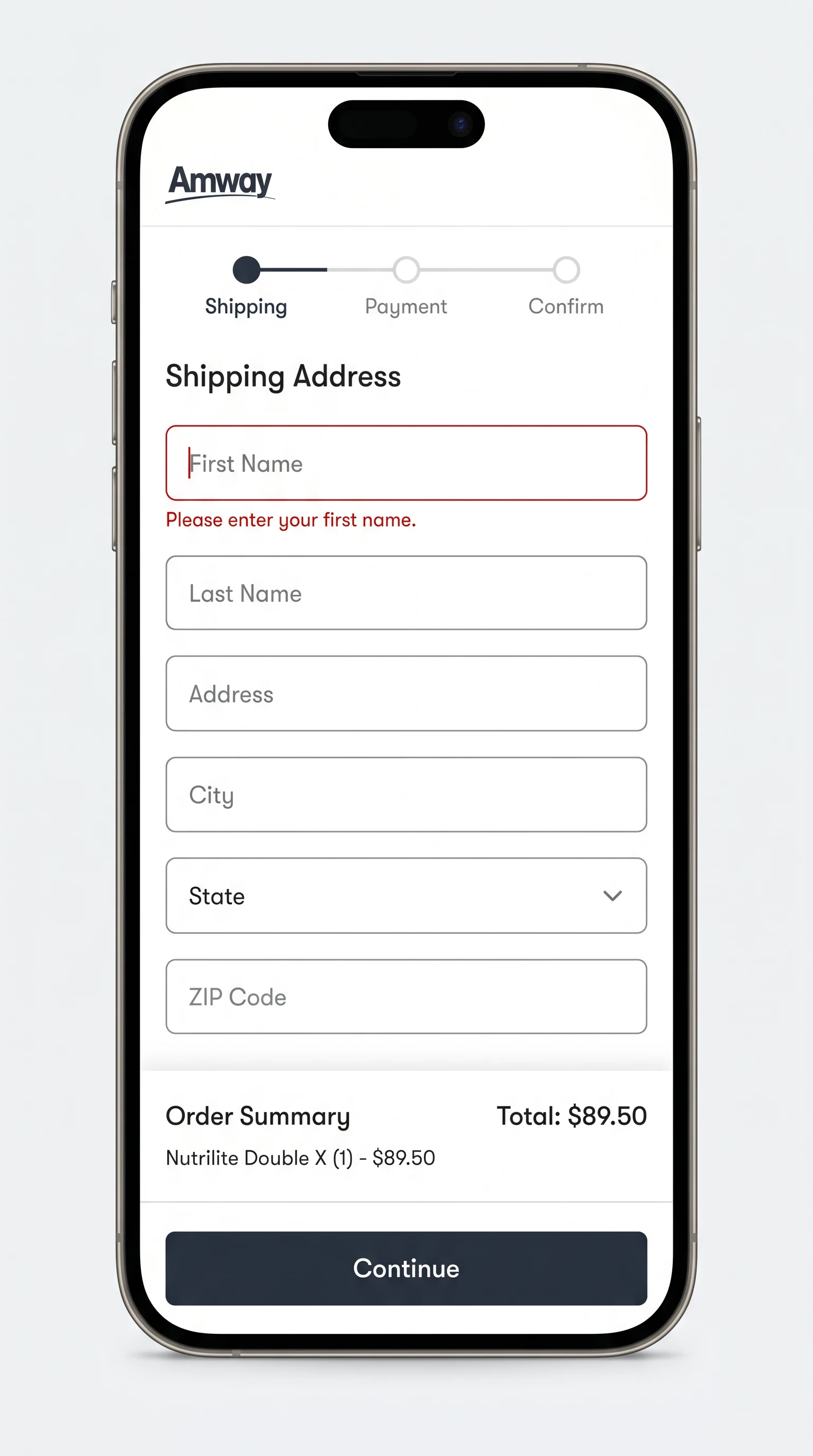
No guest checkout
A forced account step meant 37% of new users dropped before sign-up, driving post-cart drop-off to 58%.
Source · session replay + funnel analysisPV-limit confusion
PV/BV thresholds triggered confusing cart behavior — 21% cart abandonment when PV exceeded 510.
Source · support tickets + in-flow surveysPayment failures
Bank transfers failed when buyers missed the window — 16% of payments failed past the 72-hour mark.
Source · analytics + bank-transfer logsNo progress tracking
Users couldn't tell how many steps remained or what came next, eroding confidence mid-flow.
Source · moderated usability testingWeak error recovery
12% of support tickets traced back to unclear payment errors with no path to recover in-flow.
Source · support-ticket analysisThe goals
Cut checkout friction & abandonment 25%, lift payment success from 84% → 96%, and ship reusable payment components for the global market.
Strategy
Design strategy
I redefined Amway's global checkout by integrating the new brand identity, streamlining the flow around a clear Guest Checkout option, and applying a responsive, component-based design system. The work moved through four phases — each one building on a shared system model rather than patching screens.
System mapping
A Payments Ecosystem Map of user types (Guest, Customer, ABO), cart types by PV threshold, conditional payment logic per country, and error/recovery pathways.
Flow redesign
Replacing a rigid multi-step gate with a modular, progressive-disclosure model anchored by guest checkout.
Error framework
A Payments Recovery Pattern Library with defined error archetypes and contextual, recoverable messaging.
System integration
Payment cards, bank-transfer modules, PV banners, and step indicators tokenized in Figma and documented for global teams.
Foundational flow
From a rigid gate to a progressive path.
Guest or Sign-In
Guest checkout with optional account creation — no forced toll gate.
Smart Cart
Real-time PV counter with contextual tooltips so limits never surprise.
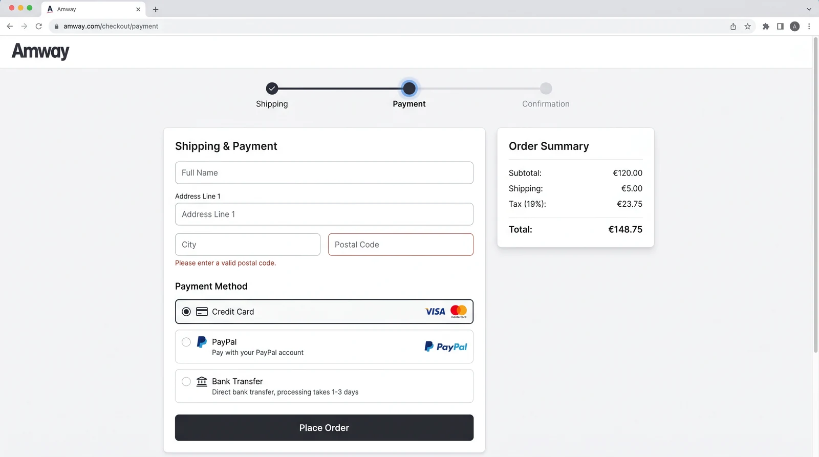
Shipping & Payment
Combined step with inline validation, smart autofill, and method-specific guidance.
Confirmation
A clear progress indicator with estimated time per step — users always know what's next.
Decisions
Three decisions that moved the numbers
Each decision is shown on real Amway screens — the legacy state beside the redesign, with the failure it removed.
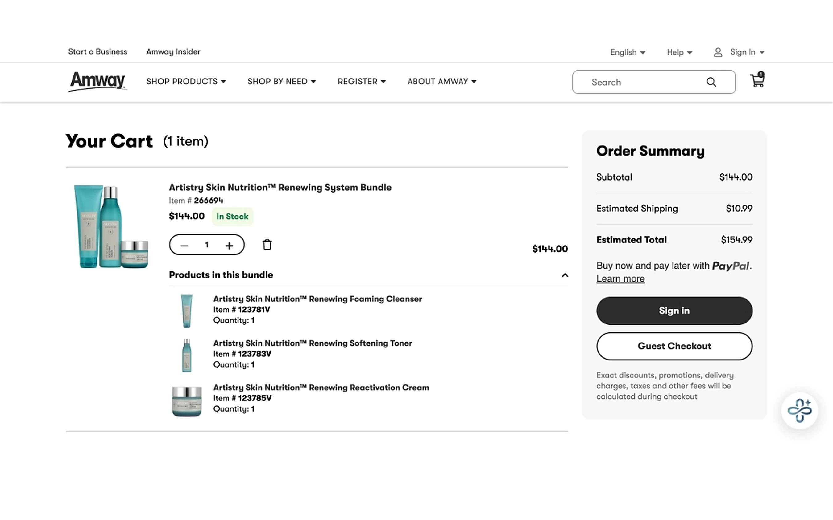
Add Guest Checkout, remove the forced gate
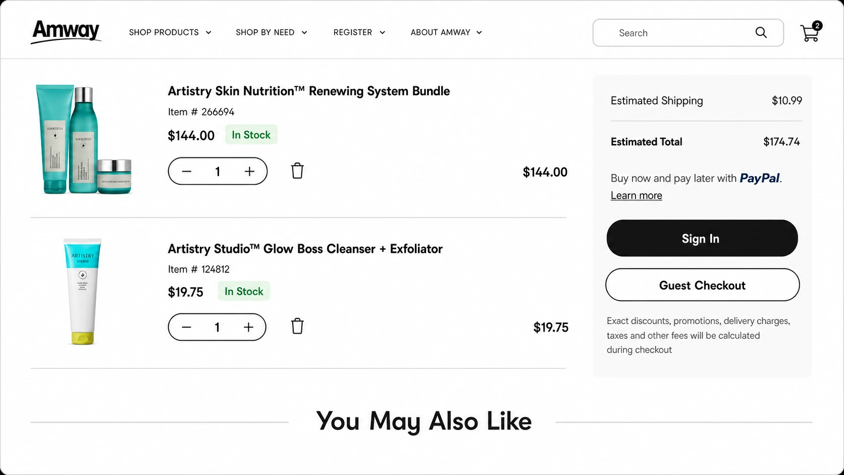
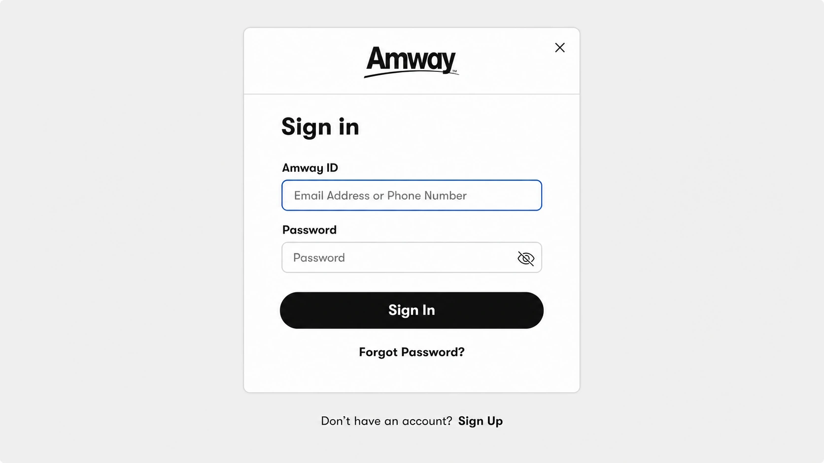
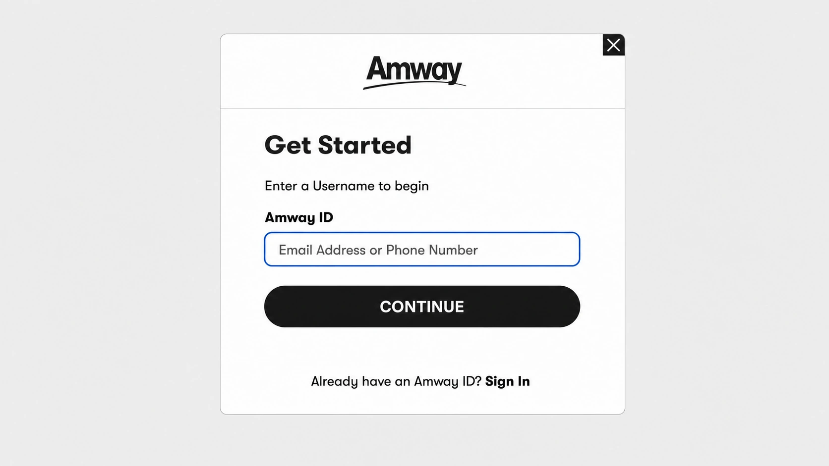
The single largest source of drop-off was a mandatory account step at the worst possible moment. From the cart, Sign in and Guest Checkout now sit with equal visual weight, and account creation becomes an optional reward after purchase — not a barrier before it.
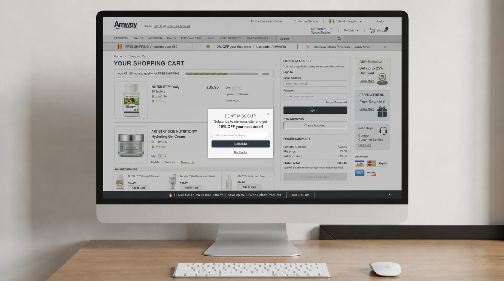
Account creation gated the purchase — a toll booth in front of the cart, buried under banners and popups.
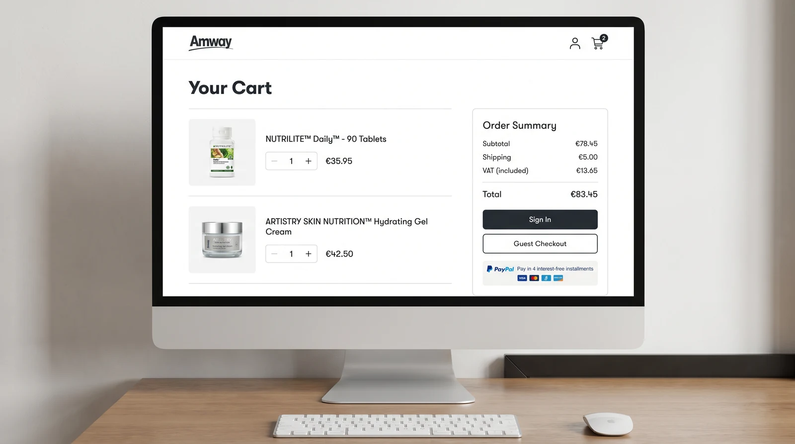
A clear, equally weighted Guest Checkout path right inside the order summary.
Make payment flexible, eligible, and trustworthy
Two audiences mean two payment realities. I moved from stacked, context-free options to a layout where eligibility lives next to each method, and added PayPal Pay-in-4 presented with plain terms and no dark patterns. Drag the handle to compare the shipping step with the Pay-in-4 explanation shoppers now see in context.
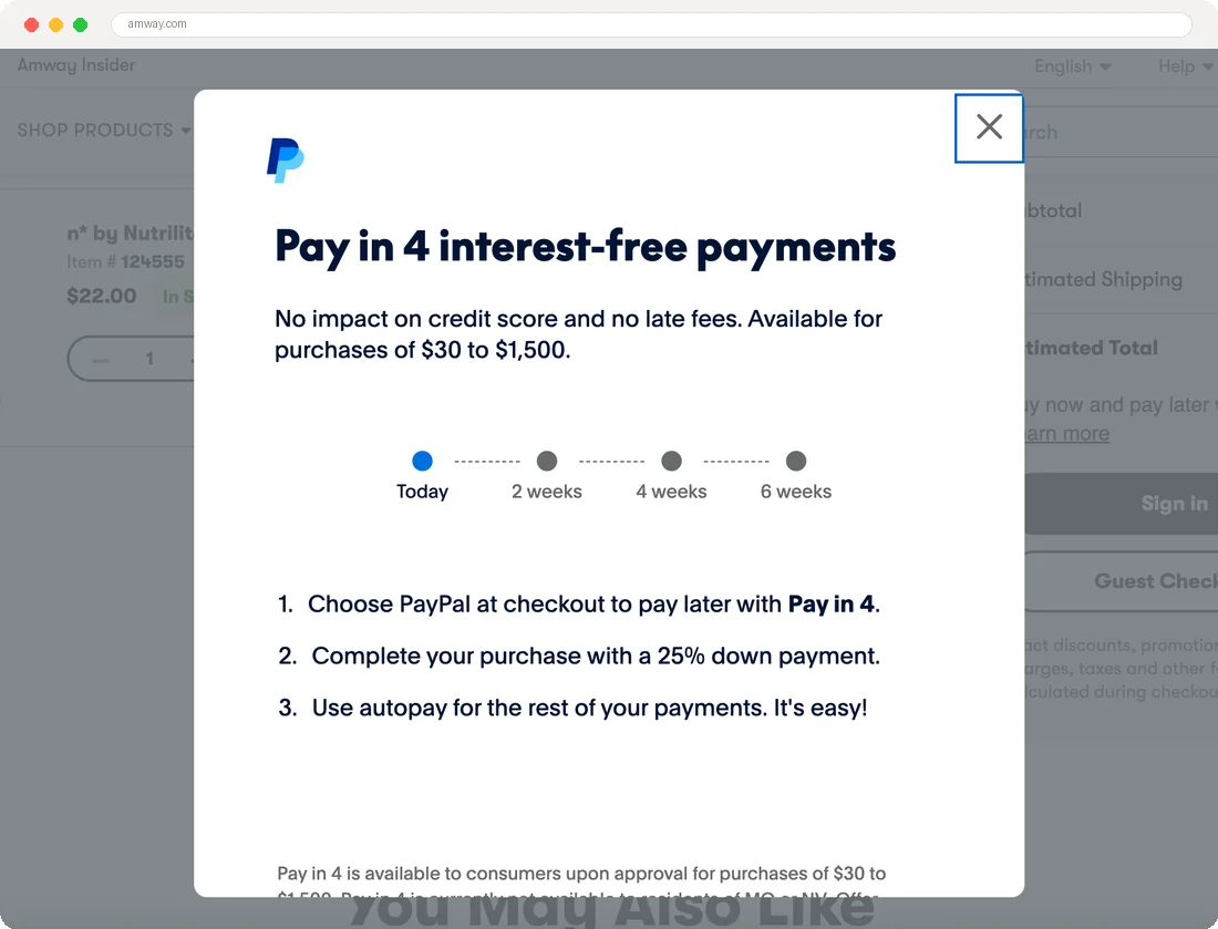
Drag the divider to move between the original payment step and the redesigned Pay-in-4 context.
Stacked options with no context — users picked ineligible methods and failed at the last step.Before · usability session
Side-by-side eligibility and interest-free terms — faster decisions, fewer failed payments.After · usability session
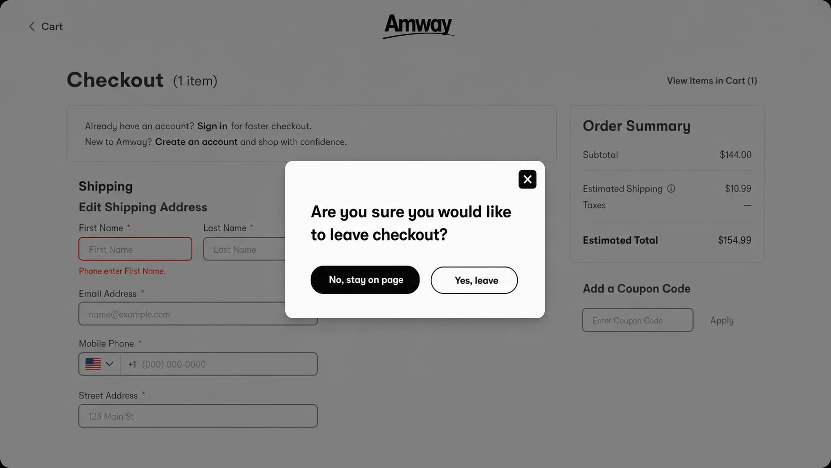
Design for failure: inline help, validation, recovery
Checkouts fail at predictable moments. I built contextual messaging for each error archetype — validation, failed processing, bank delay, COD restrictions — with inline help and fallback options (for example, “Bank transfer must be completed within 72 hours. We'll send a reminder,” or switching to card). A streamlined ABO registration flow optimizes fields, validation, and account setup while staying compliant per market.
Errors surface where the decision happens — recoverable, never a dead end.
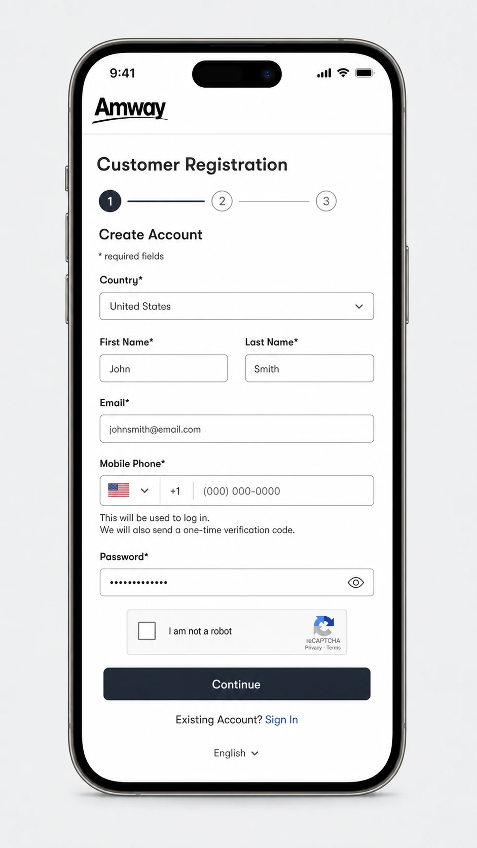
A guided 3-step registration with a visible progress indicator and optimized fields.
Key screens
The flow, screen by screen
Beyond the headline decisions, the redesign touched every step a shopper hits between the cart and a confirmed order — entry, account, and the moments where people almost leave.
Design system · interactive
Project Aurora — encode it once, ship it everywhere.
Consistency across six markets had to be structural, not manual. I contributed to “Project Aurora,” the Amway design system — an atomic library built on Amway's brand standards (GT Walsheim, Amway Black #2C2C2C) and a fluid, variable-column grid. 1,000+ artboards, 200+ user stories, documented in Storybook and Zeroheight. Switch layers to explore the foundations the checkout was built from.
Color & brand
Black and white form an empowering base; Dark Purple (PMS 2131C) represents Amway as a company and carries primary action. Six curated accent pairings add warmth — used sparingly to avoid a “rainbow” effect. Every value is a Pantone-derived token, set once and inherited across all six markets.
Base colors
Accent pairings
Type scale
GT Walsheim (Regular, Medium, Bold) is the approved type for all Latin-character UI. Noto Sans covers non-Latin languages — Chinese, Thai, Japanese, Korean — so the same hierarchy survives every market. One scale, two font families, no per-market overrides.
Tokens & fluid grid
Color, spacing, and radius live as design tokens — the contract between Figma and engineering. Everything composes onto a fluid grid with variable columns: 8 columns on desktop, flexing down to 4 on mobile.
Fluid 8-column reference grid · 48px gutters — columns flex to each breakpoint while components keep their proportions.
Components — atoms to organisms
Foundations and tokens compose into an adoptable library — Buttons, Text Fields, Checkboxes, Radio Groups, Toggles, Dropdowns, Inline Messages, Notifications, Product Cards, Modal Dialog, Progress Trackers, Tabs, Tooltips, and more — each with built-in states. These are the governed parts behind every checkout screen above.
Documented in Zeroheight and mirrored in Storybook with Token Studio — so localization and engineering teams across six markets could compose checkout from shared, governed components instead of one-off screens.
Results
A checkout that converts — and scales.
The drop-off, payment-failure, and conversion figures are measured before/after comparisons from the platform's instrumented funnel and the bank-transfer transaction logs, benchmarked against the pre-launch baseline for the same markets. The −45% COD tickets figure comes from the support team's ticket-category volume before and after rollout. Adoption (80%+ of teams, 6 markets) reflects the design-system governance tracker maintained with the global Design Systems team. Qualitative quotes are drawn from moderated usability sessions during validation.
Guest checkout collided head-on with the business model: the company makes money when shoppers register as Business Owners, so removing the forced account felt like removing the funnel. The compromise that shipped wasn't “guest vs. account” — it was guest checkout with a single, well-timed registration prompt after the purchase succeeded. Conversion and registrations both rose, because we stopped asking for commitment before we'd earned it. Naming that tension early is what got finance and growth to sign off.
Reflection
What scaling checkout taught me
Designing for ambiguity is a muscle
Payment systems are full of edge cases. Anticipating them with flexible frameworks beats patching screens one at a time.
Education ≠ overload
Users want clarity, not paragraphs. The right information at the right moment keeps people in the flow.
Inclusive design helps global users
Tooltips, explanations, and fallback paths reduce reliance on support and serve every market and ability.
Systems thinking > flow thinking
Scaling checkout globally means designing components, not just screens — so brand and behavior stay consistent everywhere.