Case study 03 · EdTech · K–11 school platform
One learning record, two audiences: a school platform for kids and parents.
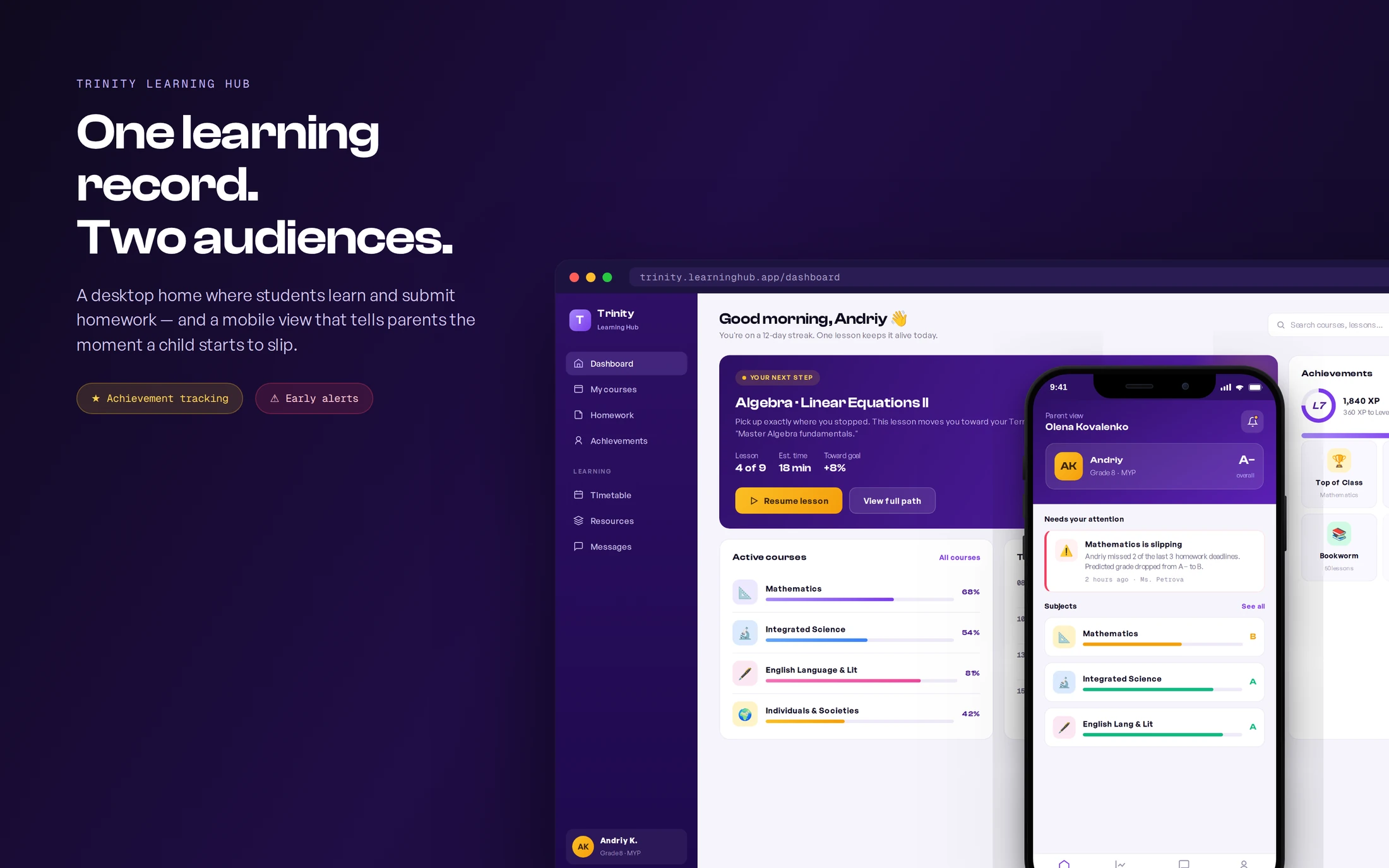
Trinity Private School — an IB World School in Limassol — runs on world-class teaching but coordinated learning, homework, and parent updates through scattered chats and spreadsheets. I designed Trinity Learning Hub: a desktop learning experience where students see their next step and track achievements, and a mobile companion that gives parents an honest, early signal the moment a child starts to fall behind.
Try the student dashboard for yourself
A clickable build of the student desktop home — switch sections in the sidebar, resume a lesson, and submit homework to see the closed loop in action.
Context
A world-class school, coordinated over chat
Trinity is a licensed IB World School teaching grades 1–11 across two Limassol campuses, with strong academics and an inquiry-based curriculum. But the digital layer hadn't caught up. Learning, homework, grades, and parent communication lived in different places — a learning portal here, a gradebook there, and day-to-day updates over a Telegram "family manager" channel.
For students, that meant logging in to a catalog of material with no clear sense of what to do today. For parents — many of them busy professionals in an international community — it meant finding out their child was struggling only at the term report, when it was already late to act.
The brief: design one coherent platform that helps kids learn and submit work, lets them see achievement build over the year, and gives parents an early, mobile-first warning when a child underperforms.
Approach
My role & approach
As lead product designer, I owned the work end to end — from research and information architecture through both interfaces, the design system, and engineering handoff to a distributed team. Two device decisions anchored everything:
- Students on desktop. Kids do focused schoolwork — reading, homework, submissions — at a desk, so the student experience is a roomy desktop workspace.
- Parents on mobile. Parents check in on the move, between meetings and pickups, so the parent experience is a glanceable phone app built around alerts.
- One shared record. Both surfaces read from a single learning record, so a missed deadline a student sees is the same event a parent gets alerted about — no parallel sources of truth.
- Designed for the bad news first. The hardest, highest-value moment is telling a parent their child is slipping — kindly, early, and with a next step. I designed that flow before the happy path.
Discovery
I designed around two very different users, in two languages.
Trinity's community is international, so I ran research with students, parents, and teachers — across English and Russian-speaking families — to find where the current setup failed each group, and what "on track" actually meant to them.
What the research said
Three failures, three different people
The same fragmentation hurt each group in a different way. Each is a separate, fixable design problem — which is why one generic "portal" was never going to be enough.
Students drift
Kids opened to a list of everything and lost their first minutes deciding instead of learning — no single, obvious next step.
Source · student interviews + observationParents find out last
Parents learned about a slipping grade at the term report, when the window to help had already closed.
Source · parent interviewsTeachers chase
Homework arrived over chat, email, and on paper, so teachers spent time collecting work instead of teaching.
Source · teacher interviews + auditThat evidence reframed the brief from “build a school portal” to “build two role-specific experiences over one shared record — and make the underperformance signal the product's headline feature.”
Research
How I learned what “on track” meant to each family
A mixed-methods study over four weeks, run bilingually so English- and Russian-speaking families could answer in the language they think in. The goal was specific: find the exact moment each group loses trust in the current setup, and what evidence would earn it back.
Contextual interviews
19 sessions with students, parents, and teachers — each walked through the tools they actually use to answer “how is my child doing?”
Diary study
8 parents logged every moment they wondered about their child’s progress for two weeks — capturing the real triggers, not recalled ones.
Tool & artifact audit
Mapped the chats, spreadsheets, emails, and paper that homework and grades flowed through, to quantify the fragmentation teachers described.
Concept tests
Two rounds of clickable concepts — the next-step dashboard and the parent alert — tested with 11 participants to validate comprehension and tone.
Who I spoke with
19 participants, three points of view
I recruited for the friction, not the average: families who’d been surprised by a grade, students at every band, and the teachers who carry the coordination load.
What I heard
Four findings that set the design direction
Parents discover problems too late to help
The first formal signal was the term report — weeks after the work that caused it. By then the conversation was about blame, not recovery.
“By the time I see the report, it’s already a fight. I just want to know in the moment, while I can still do something.”Parent · Grade 8
Students freeze at a wall of choices
Opening to a full catalog cost kids their first focused minutes. They wanted to be told the one next thing, not to plan their own study session.
“There’s so much on the screen I don’t know where to start, so I just… don’t.”Student · Grade 7
A red badge without a next step breeds anxiety
Early concept tests showed a bare alert made parents panic and distrust the app. The fix wasn’t softer wording — it was always pairing the bad news with an action.
“Don’t just tell me it’s bad. Tell me bad, then tell me exactly what to tap.”Parent · concept test, round 1
Teachers lose teaching time to collection
Homework arrived across four channels, so staff spent the start of class chasing and reconciling submissions instead of teaching.
“I spend the first ten minutes working out who actually handed in — across three apps and a pile of paper.”Teacher · Mathematics
Every finding became a design move
Architecture
One data model. Two role-aware experiences.
Before any screen, I mapped the shared learning record and the risk engine that watches it — so a student's desktop view and a parent's mobile view are always two windows onto the same truth.
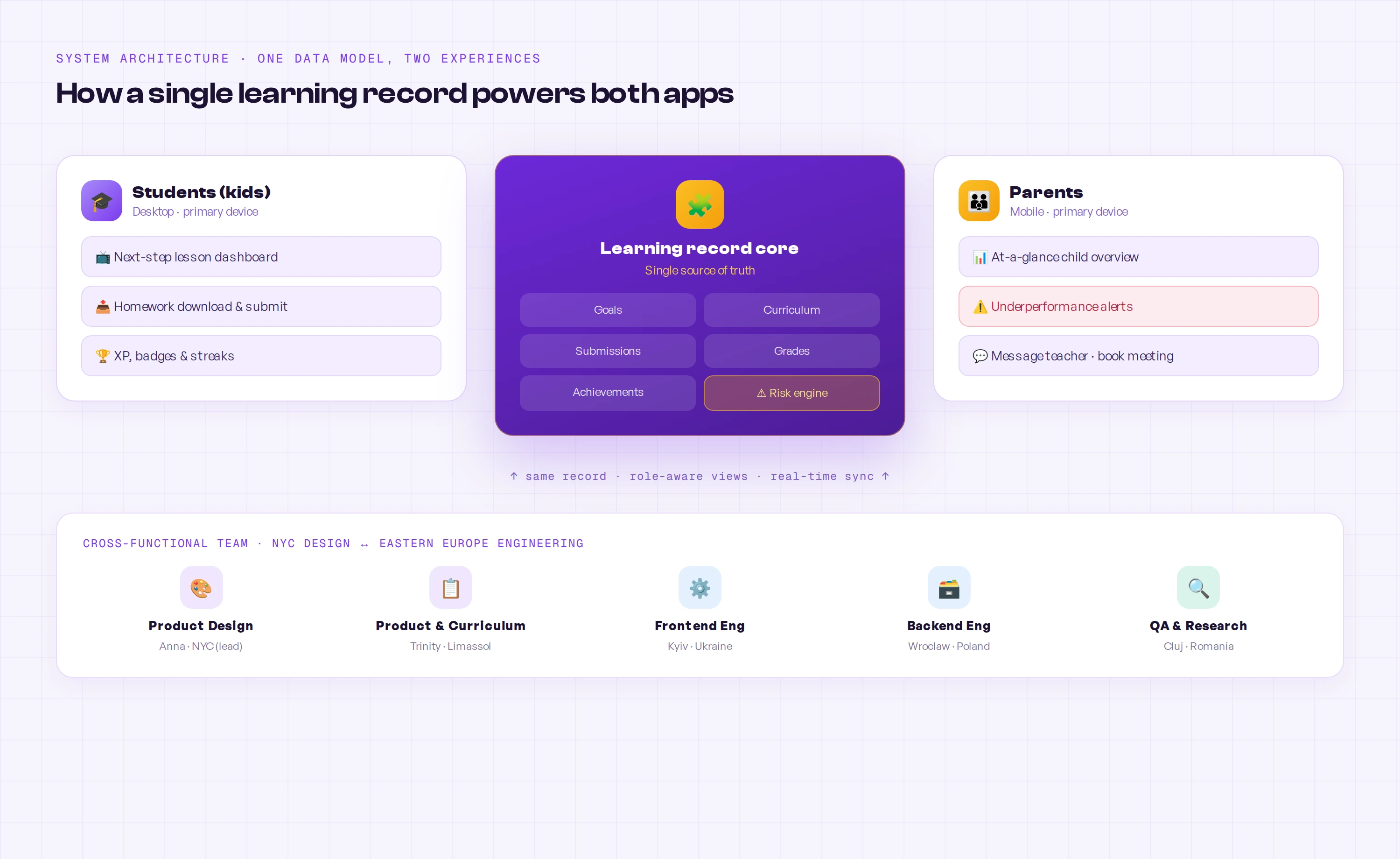
Decisions
Key design decisions
Four moves carried the product: give students a next step, make achievement visible across the year, make homework a closed loop, and make the parent alert kind but unmissable.
Open students on the next step, not the catalog
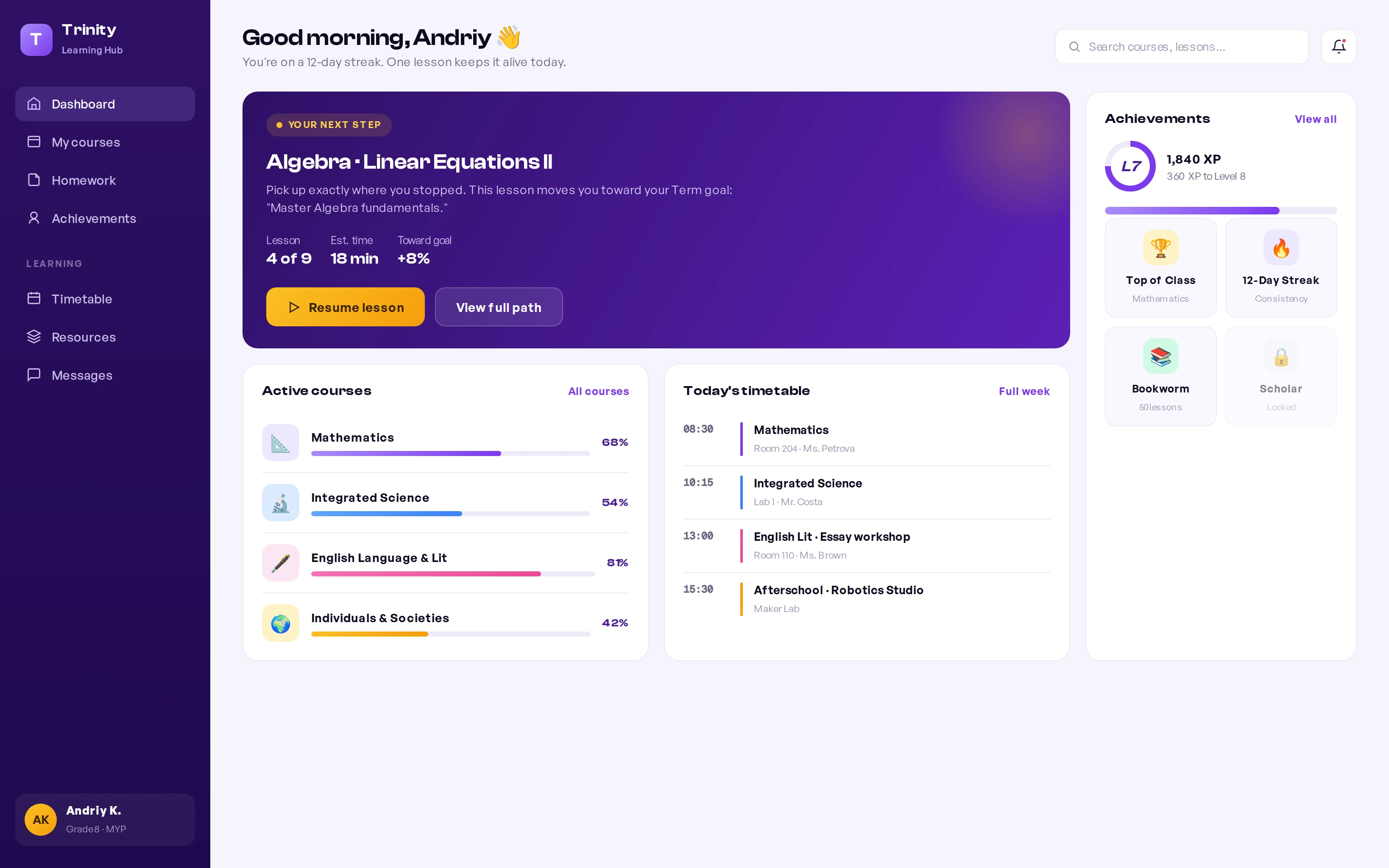
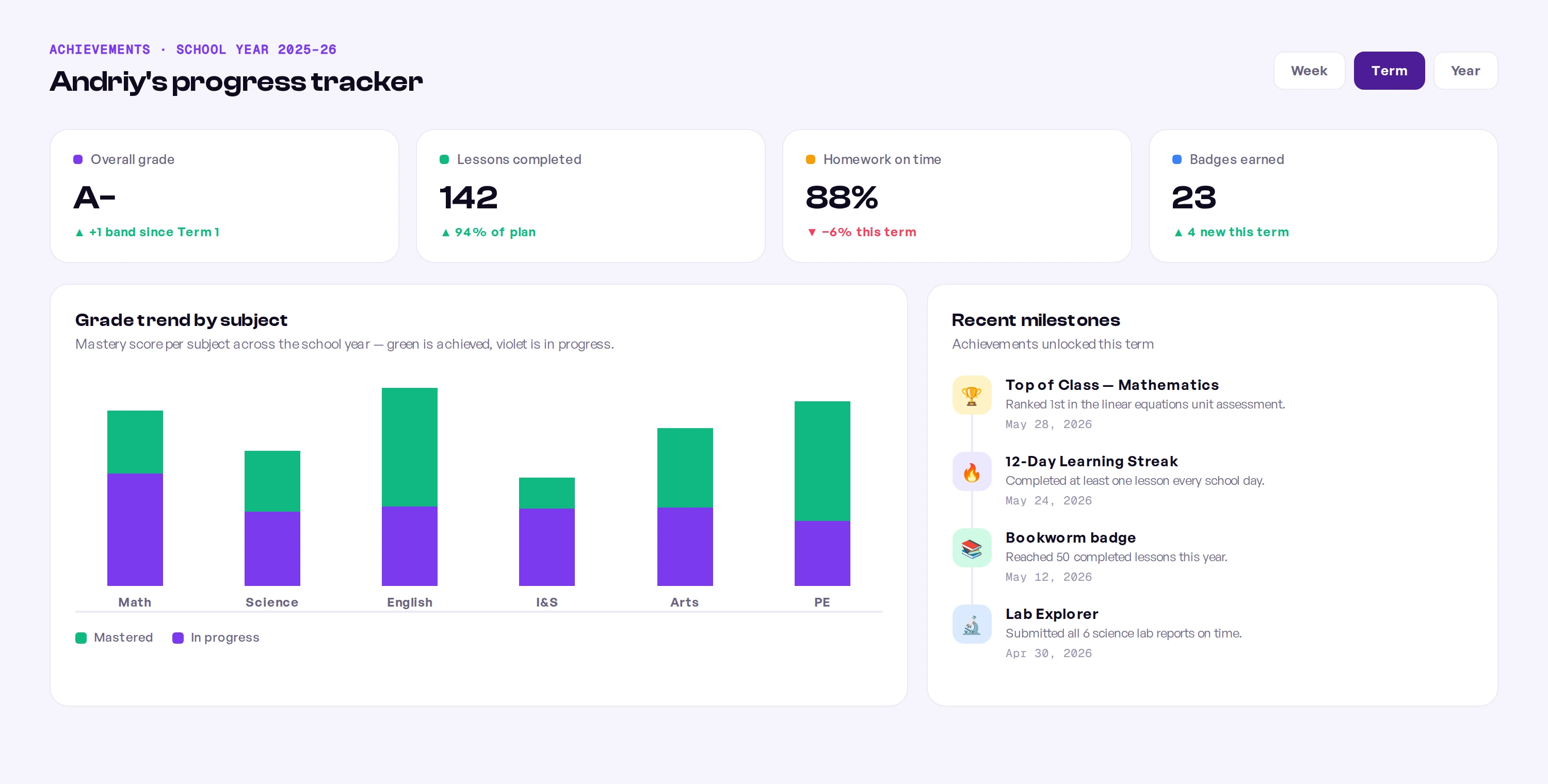
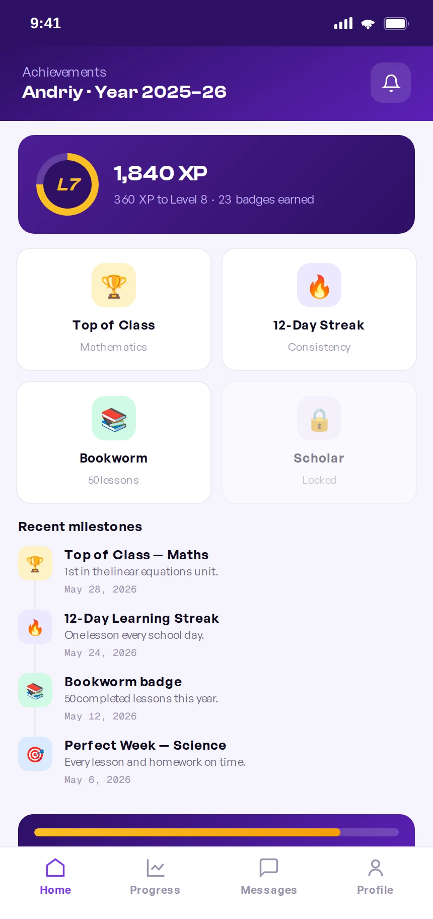
The student desktop leads with one prioritized next lesson tied to a term goal — with lesson position, time estimate, and the progress it unlocks — so a child knows exactly where to start. Everything else (courses, timetable, achievements) supports that one decision instead of competing with it.
Make a year of achievement visible — and motivating
Trinity wanted students to feel progress across the school year, not just see grades. I built an achievement layer — XP, levels, badges, streaks, and a per-subject mastery view — so each child can watch effort compound. The structure underneath is a simple, honest five-layer model that connects daily work to long-term goals.
Goals
The student's term goal — the anchor every lesson ladders up to.
Courses
Subjects mapped to goals, each showing real progress, not a flat list.
Lessons
Focused units that always resolve to a clear next action.
Homework
Applied work, downloaded and submitted, that turns content into mastery.
Achievement
XP, badges, and mastery — visible advancement that feeds back into goals.
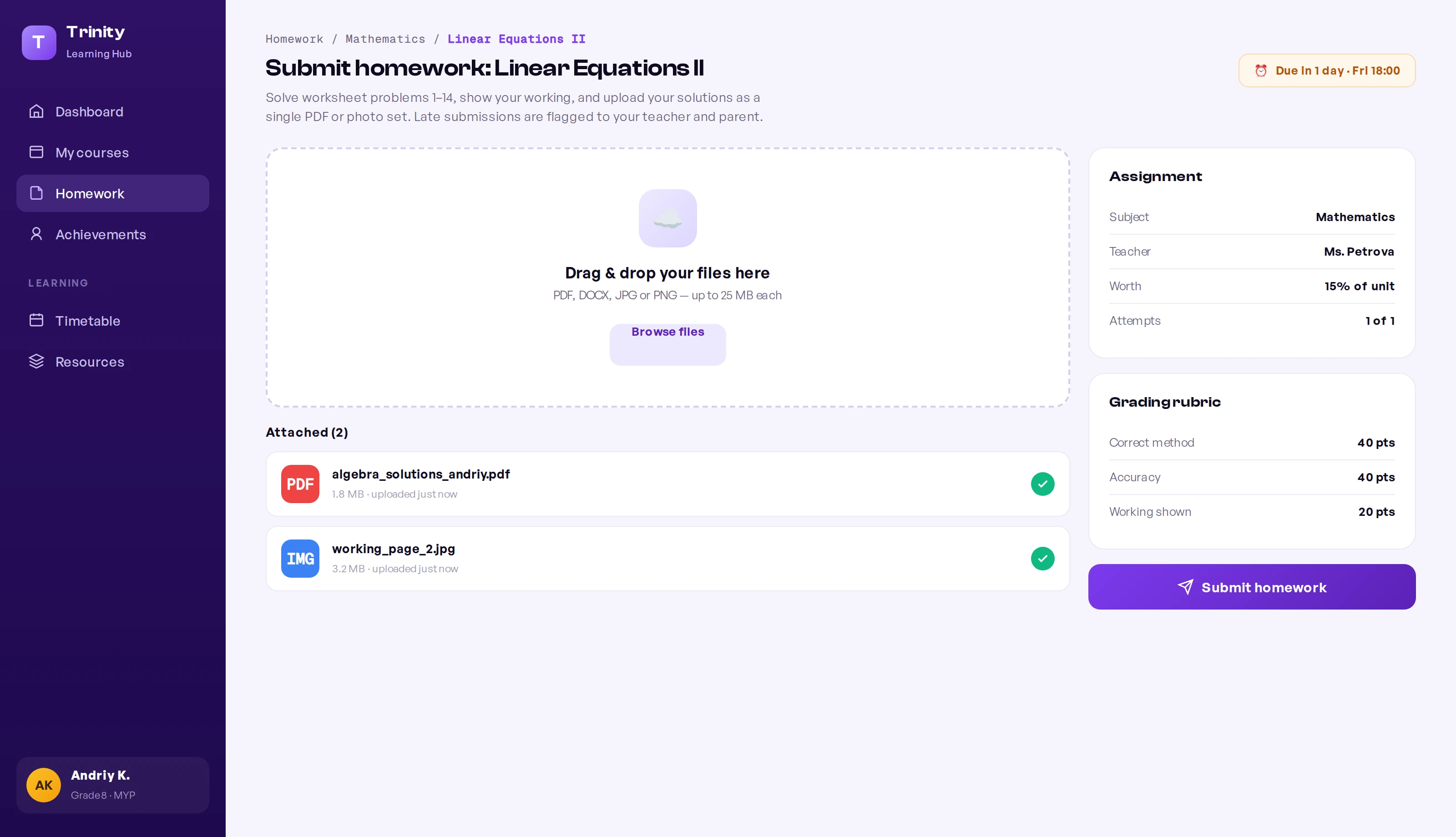
Turn homework into one closed loop
Homework moved off chat and paper into a single flow: students download the brief, see the rubric and weighting, and submit files in one place. The system timestamps submissions, so "on time" is a fact, not a debate — and a missed deadline becomes a clean signal the risk engine and parents can act on.
Tell parents early — kindly, on their phone
This was the headline feature. The parent app is mobile-first and built around a single promise: if your child starts slipping, you'll know in days, not at the term report. When the risk engine detects a pattern — missed deadlines, a falling predicted grade — it sends a clear, non-alarming alert that names the issue, shows the trend, and offers a next step: message the teacher or book a meeting.
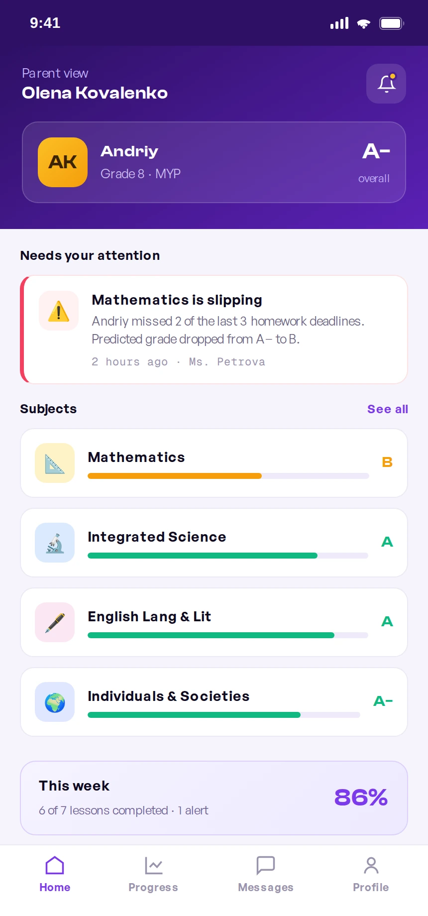
The parent home opens on “needs your attention” — the slipping subject surfaces first, with the predicted-grade drop spelled out plainly.
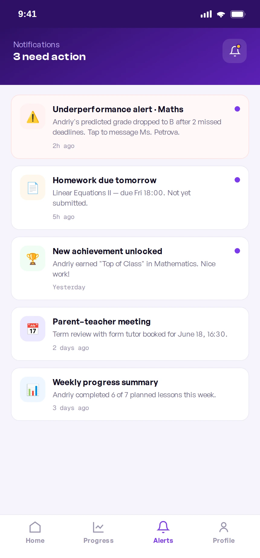
Every alert is actionable: the underperformance notice leads straight to messaging the teacher, never a dead-end red badge.
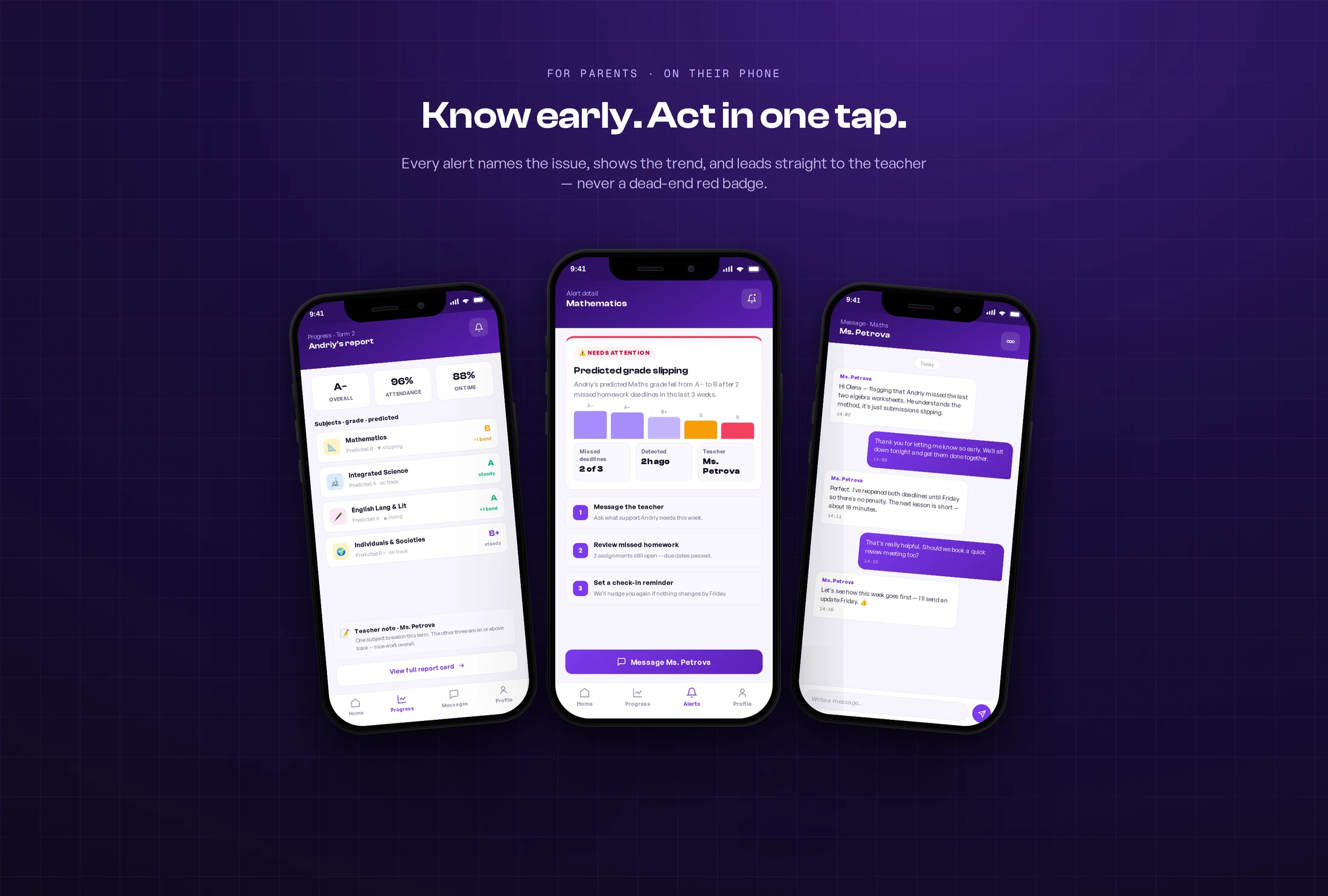
Beyond the alert itself, I designed the screens a worried parent reaches next — each kept short and scannable so the whole story fits on one phone, no endless scrolling:
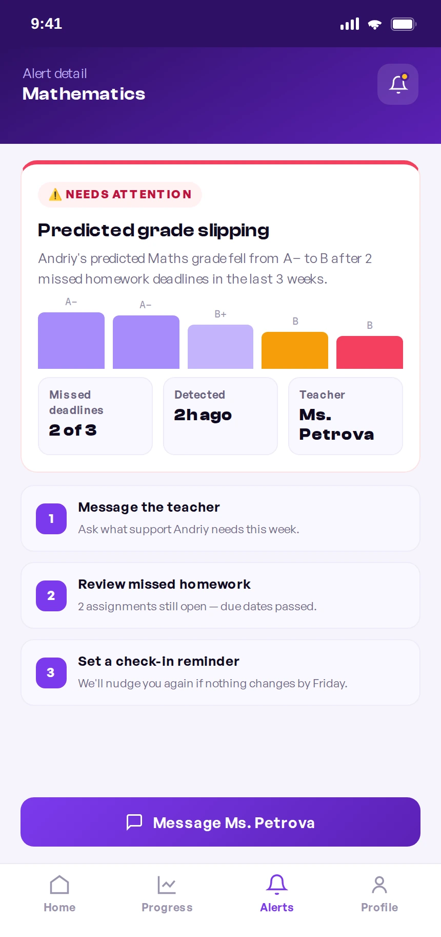
The full alert: what slipped, the trend behind it, and the next step — in one screen.
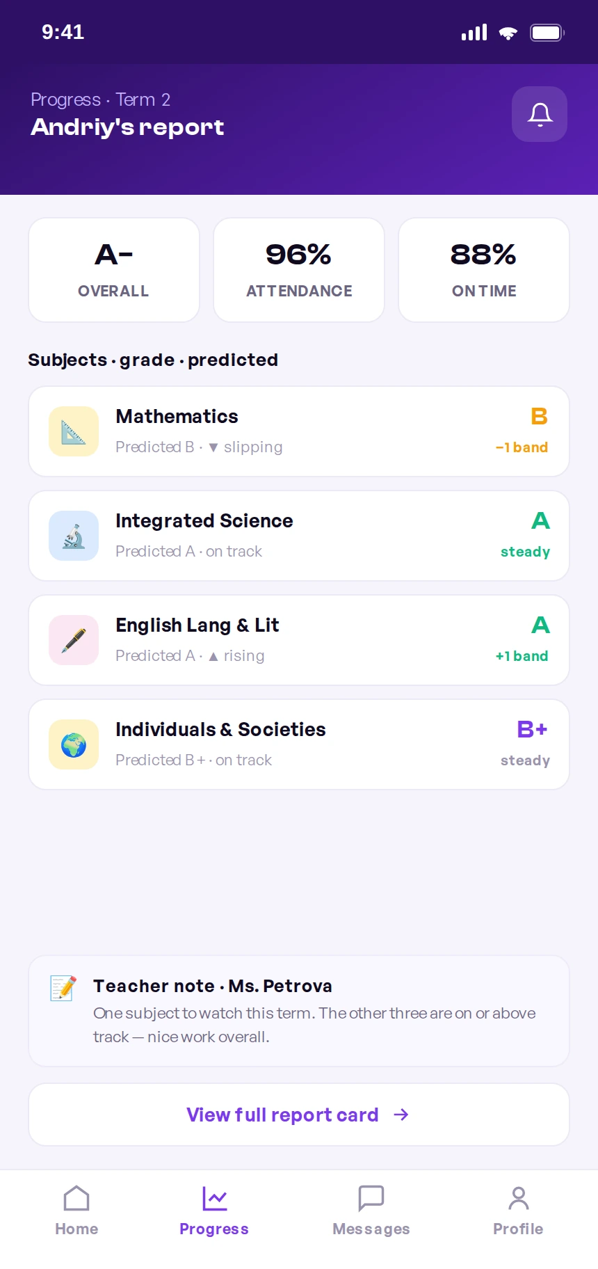
A term snapshot: overall grade, attendance, and a predicted grade per subject.
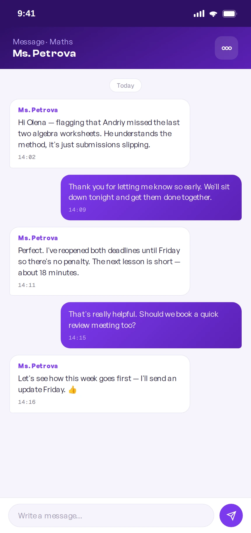
The conversation the alert opens — calm, direct, and already in context.
Good news too: badges, streaks, and a year of milestones worth celebrating.
Process
End to end, across three countries and four time zones.
I ran the project from framing to shipped build with a distributed team: product design in New York, the school's teachers and academic staff in Cyprus, and the engineering team spread across Eastern Europe. Here's how the work actually moved.
Frame
Aligned with the school on the riskiest assumption: parents act if warned early.
Research
Bilingual interviews with students, parents, and teachers across both campuses.
Architect
Mapped the shared record and risk engine before designing a single screen.
Design
Built both surfaces and a token-based system in Figma, documented in Zeroheight.
Build
Paired async with EE engineering through Linear tickets, Loom, and weekly overlap calls.
Validate
Moderated Maze tests with families, then iterated the alert tone and thresholds.
Cross-functional
How a distributed team stayed one team
With design in NYC and engineering 7–9 hours ahead in Eastern Europe, we couldn't rely on real-time chatter. So the collaboration was deliberately async-first, with a small, protected window of live overlap.
Source of truth in Figma + Zeroheight
I shipped tokenized components with documented states and redlines, so engineers in another time zone never had to guess what a spec meant.
Component-driven build, mirroring the system
Frontend implemented the design system 1:1, so the student desktop and parent mobile shared the same primitives — and fixes propagated everywhere.
The shared record + risk engine
Backend owned the single learning record and the rules that decide when a child is "at risk" — the logic behind every parent alert.
Testing the bad-news path hardest
QA prioritized the alert flow and edge cases — because an alert that fires wrongly, or fails to fire, costs trust fastest.
The operating rhythm: written specs and Loom walkthroughs for everything async, plus one daily overlap hour to unblock decisions live. Linear tied design, build, and QA to the same tickets.
What went wrong
The hard parts — and how we worked through them.
A FAANG-level project isn't one that avoids problems; it's one that surfaces and resolves them honestly. These are the real frictions of shipping this product with a distributed team — and the decision that unstuck each one.
The alert almost did more harm than good
Our first underperformance alert was blunt — a red “Your child is failing” banner. In testing, parents either panicked or dismissed it, and a few teachers worried it would trigger anxious messages at midnight. The signal was right; the tone was wrong.
“Underperforming” meant five different things
Design, teachers, and backend each had a different definition of at-risk — a low grade, a missed deadline, a downward trend. Early builds fired alerts inconsistently, which is the fastest way to lose parent trust.
Two devices, one system — and it kept drifting
Designing student-desktop and parent-mobile in parallel, the two surfaces started diverging — buttons, spacing, and status colors subtly differed, and engineering was rebuilding the same component twice.
The time-zone gap turned small questions into lost days
With NYC design and Eastern Europe engineering barely overlapping, a one-line ambiguity in a spec could stall a ticket for a full day while everyone waited to be awake at the same time.
A bilingual, international community broke our layouts
Trinity's families span several languages, and Russian and other translations ran 30–40% longer than English — overflowing buttons, alert cards, and the tight mobile notification rows.
Design system
The system both apps are built from.
Parity across two platforms only held because the system came first. Foundations, type, tokens, and components were decided once, documented, and adopted by engineering 1:1.
Color
A calm indigo base with a violet signal and a warm gold for achievement — chosen once, inherited across both apps.
Modular scale ratio 1.250
One ratio keeps hierarchy honest for both a roomy desktop and a tight phone — with headroom for longer translations.
The contract
The shared interface between NYC design and Eastern Europe engineering — change once, propagate to both apps safely.
Composed patterns
Foundations and tokens assemble into components both apps share — each shipping with built-in states.
Outcome
From scattered chats to one trusted system.
This is a concept commissioned around Trinity, designed and prototyped to a buildable spec rather than launched with live A/B instrumentation — so outcomes are framed as structural and qualitative, not lift percentages. The two-surface architecture, the 4 → 1 consolidation, and the shared design system are design-artifact facts. Next-step clarity and the alert tone come from moderated Maze sessions with students and parents, where the early-warning flow was the decisive test: parents had to understand the alert, trust it, and know what to do next without coaching.
The whole product hinged on parents trusting the underperformance alert. My first version was technically accurate but emotionally tone-deaf — and a warning system parents mute is worse than none at all. The lesson that shaped the final design: with sensitive signals, tone is a feature. Naming the issue calmly, showing the trend, and always offering a next step is what turned an anxiety-inducing red badge into something parents said they'd actually want.
What I'd do next. Instrument the alert in production to tune thresholds against real outcomes — measuring how often an early warning leads to a parent action and a recovered grade — and add a lightweight teacher view so the loop closes on all three sides.
Reflection: the win wasn't a prettier portal. It was deciding the product's real job was an honest, early, kind signal — and designing everything else in service of that.
Business impact · ROI
What early intervention is worth to a school.
For a private school, the business case is retention and reputation: families stay — and refer — when they trust the school to catch problems early. I sized the impact the way a product team would size a bet.
These are projections, not measured launch results — stated as ranges to be honest about uncertainty. The on-time homework lift is benchmarked from published EdTech studies on submission tooling and deadline visibility. The retention and referral effects are directional, tied to the fact that for tuition-funded schools a single retained family is worth years of fees, so even a small trust-driven re-enrolment gain dwarfs the build cost. The 4 → 1 consolidation reflects the actual tools the workflow replaced.