Case study 01 · Retail commerce · Custom window-treatments retailer
eCommerce transformation: three flows into one conversion system.
A custom window-treatments retailer with 90+ showrooms had grown page by page. I rebuilt the three highest-intent flows around a single question and a single next step.
Overview
The problem
Blinds To Go is a custom window-treatments retailer with 90+ showrooms across the US and Canada. Shoppers could buy online, book an in-home design appointment, or visit a showroom — but each route had been built separately, with inconsistent patterns and dead ends at the exact moments that decided a sale.
Rather than repaint every page, I focused on the three flows that carried the most intent and leaked the most conversion: Shop at Home, Find a Showroom, and Mobile Navigation. Each was rebuilt around a single question a shopper was actually asking — and a single, obvious next step.
As Lead Product Designer I owned the strategy, the end-to-end UI for every flow, and the design system and layout grid that let the work stay consistent as it scaled across web and mobile.
Discovery
I started where the conversion leaked, not where the backlog pointed.
Before touching a single screen, I triangulated four sources to find where high-intent shoppers actually dropped — then let that evidence decide which flows to rebuild.
What the research said
Three intents, three leaks
Funnel analytics told me where people left; session replays and 18 moderated sessions told me why. Three high-intent journeys accounted for the majority of leaked conversion — and each leaked at a different, fixable moment.
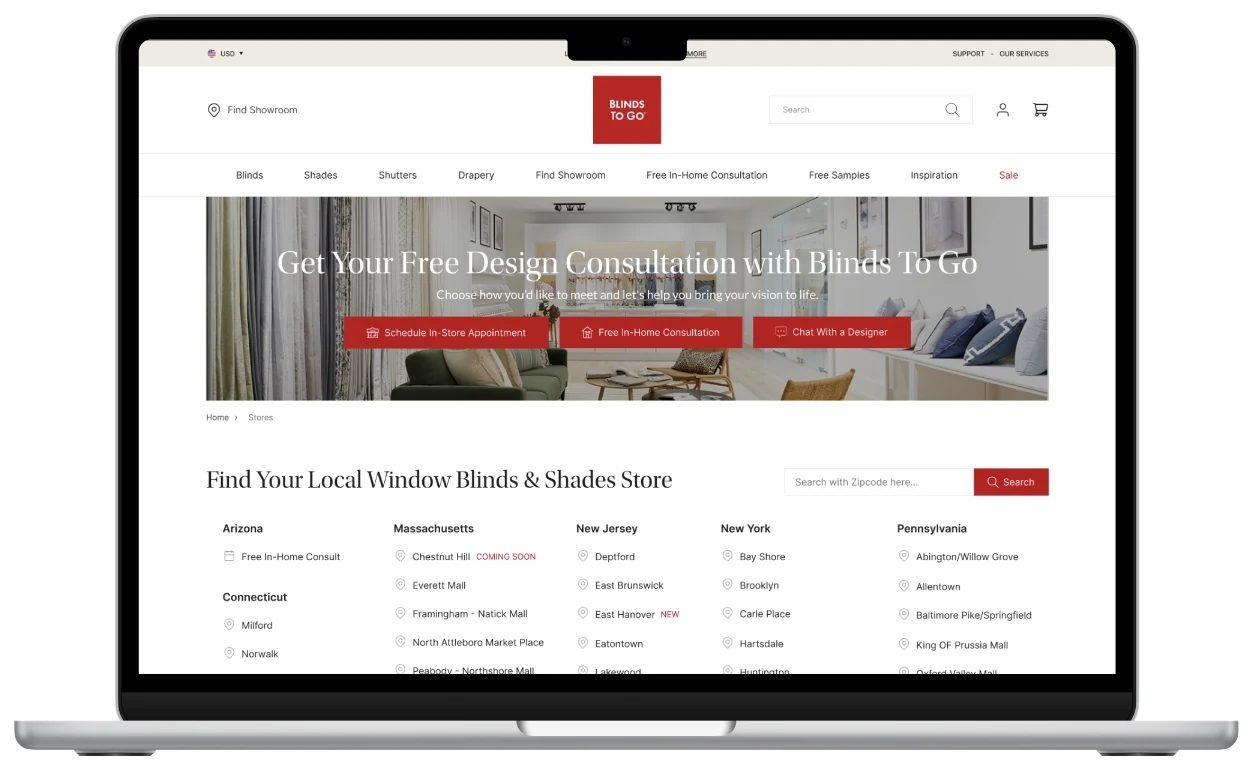
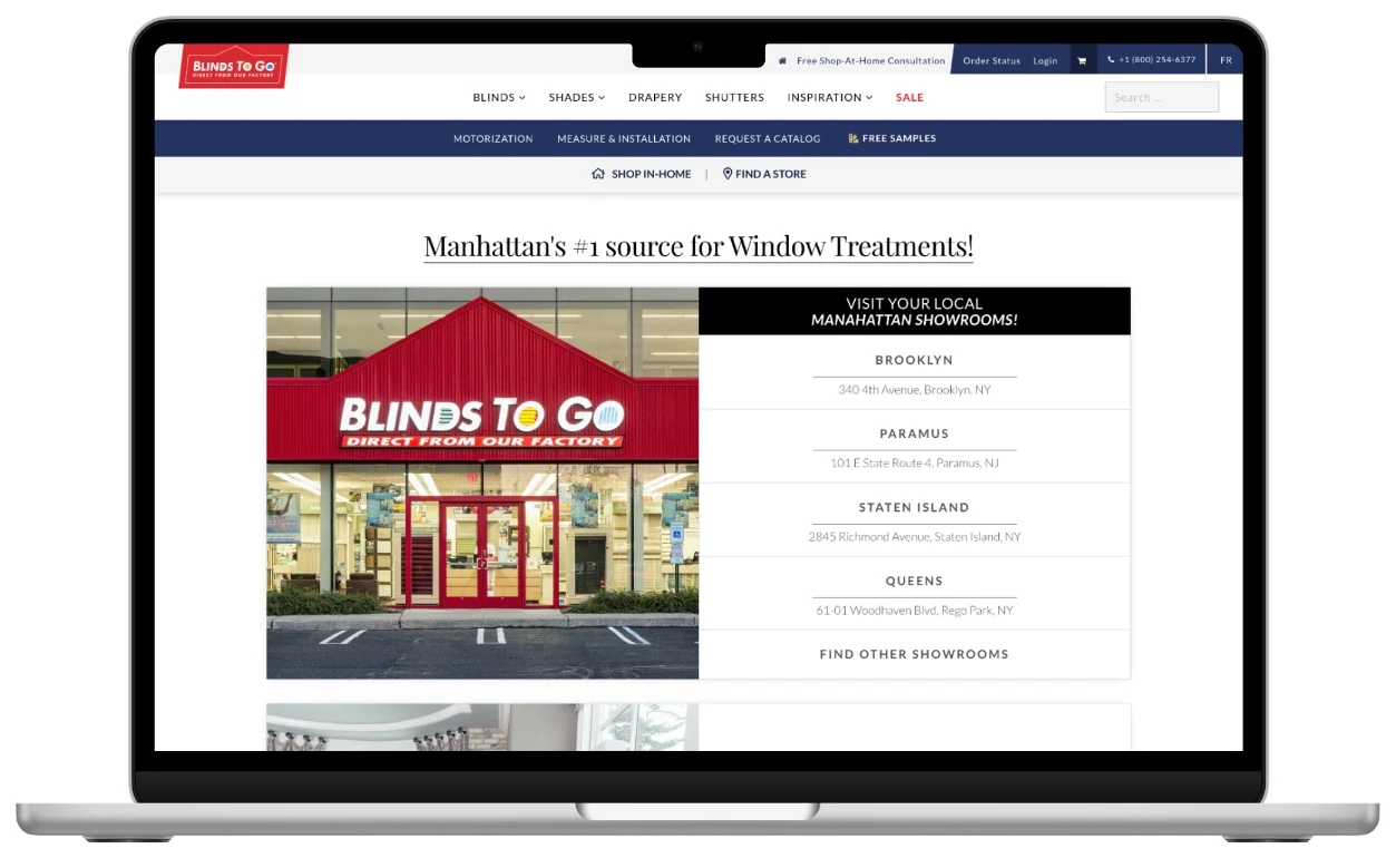
Find a Showroom
Shoppers ready to visit hit a text-only state list and couldn't tell which store was theirs — the highest-intent journey with the weakest payoff.
Source · session replay + 18 usability sessionsShop at Home
A four-step explainer buried the one action that mattered — booking a free in-home consultation — below promos and a carousel.
Source · funnel drop-off + task analysisMobile Navigation
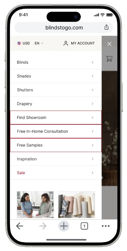
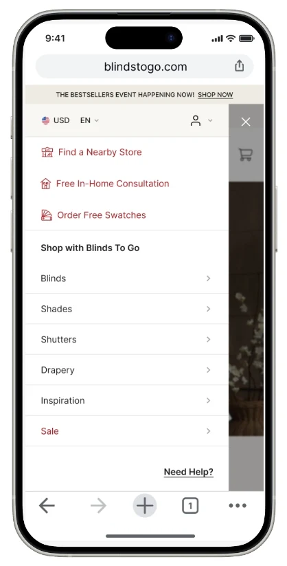
Mobile mirrored a product-first desktop IA; people came to do something (visit, book, get help) and had to translate it themselves.
Source · mobile session replay + card sortThat evidence is what scoped the work to three flows instead of a full-site repaint — the change with the most measurable upside per sprint.
Flows
Three flows, redesigned
Each flow is shown exactly as it shipped — the real before state above the real after state, with the shopper question each redesign answered.
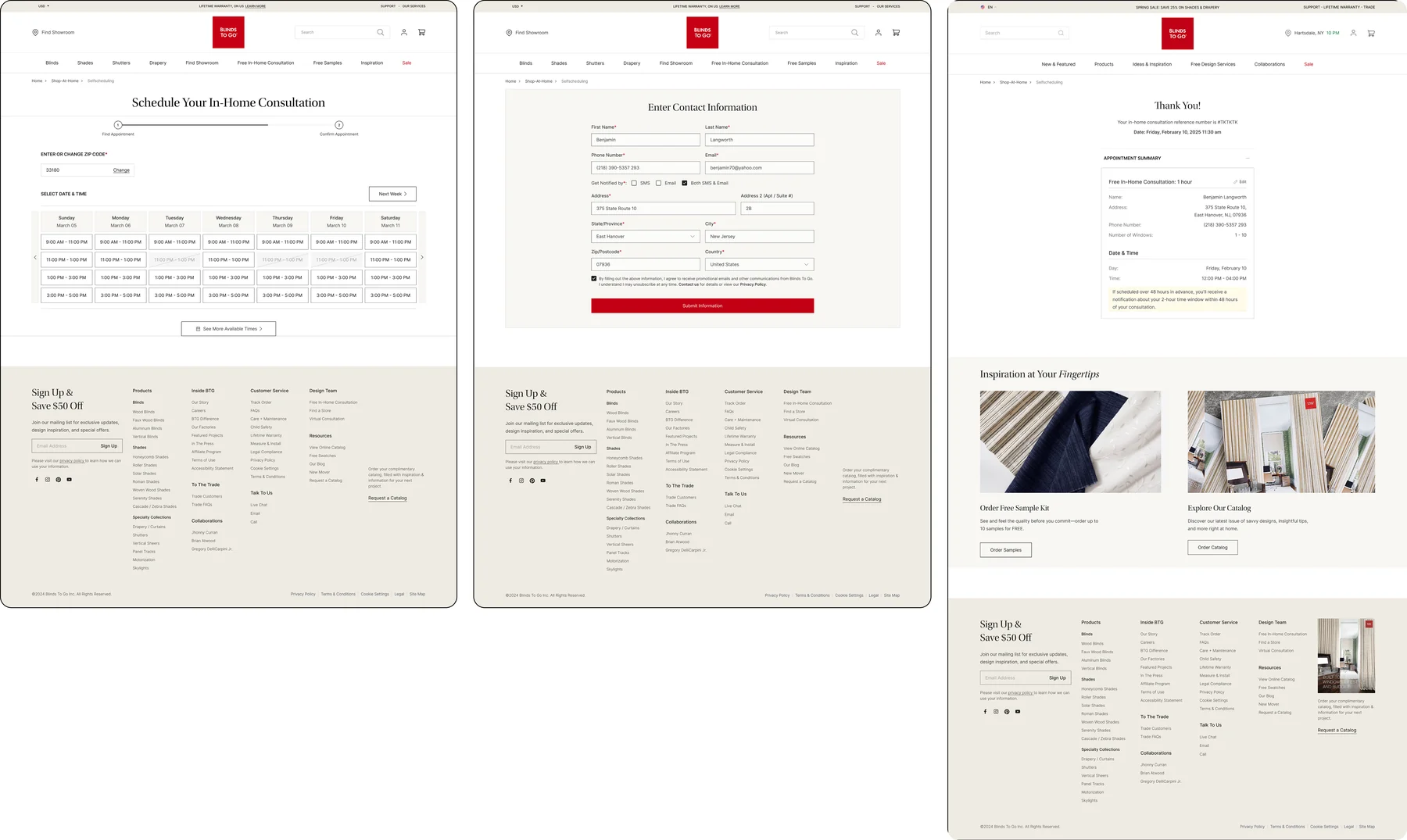
Shop at Home
The page introducing the free in-home design service was a wall of numbered steps and stock photography. I rebuilt it around one editorial promise — Free In-Home Design Appointment — with a single zip-code entry point and proof from real designer projects directly beneath it.
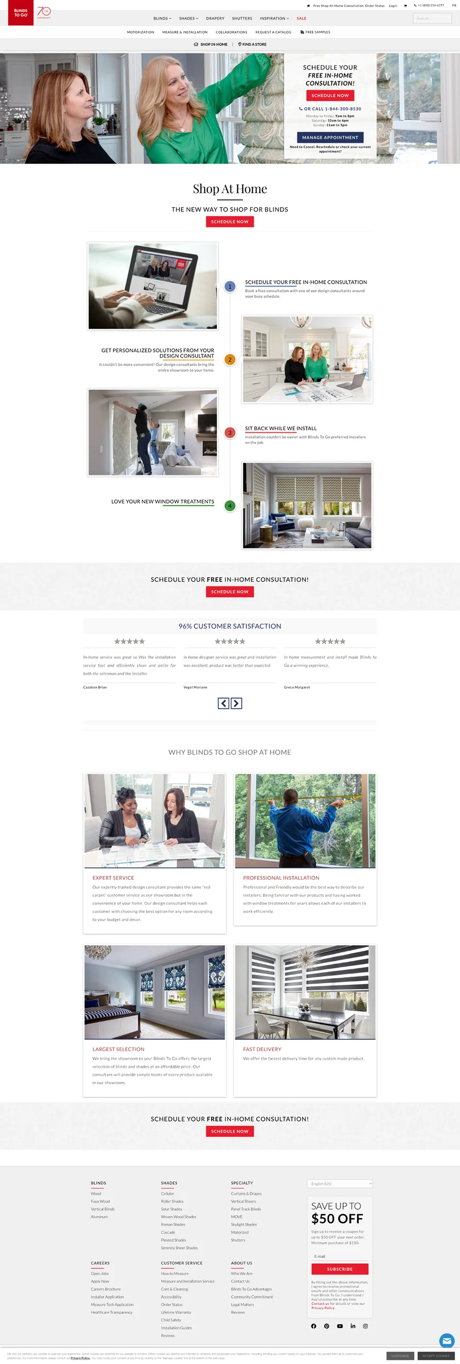
A four-step explainer competing with promos and a carousel — the actual booking action sat low and easy to miss.
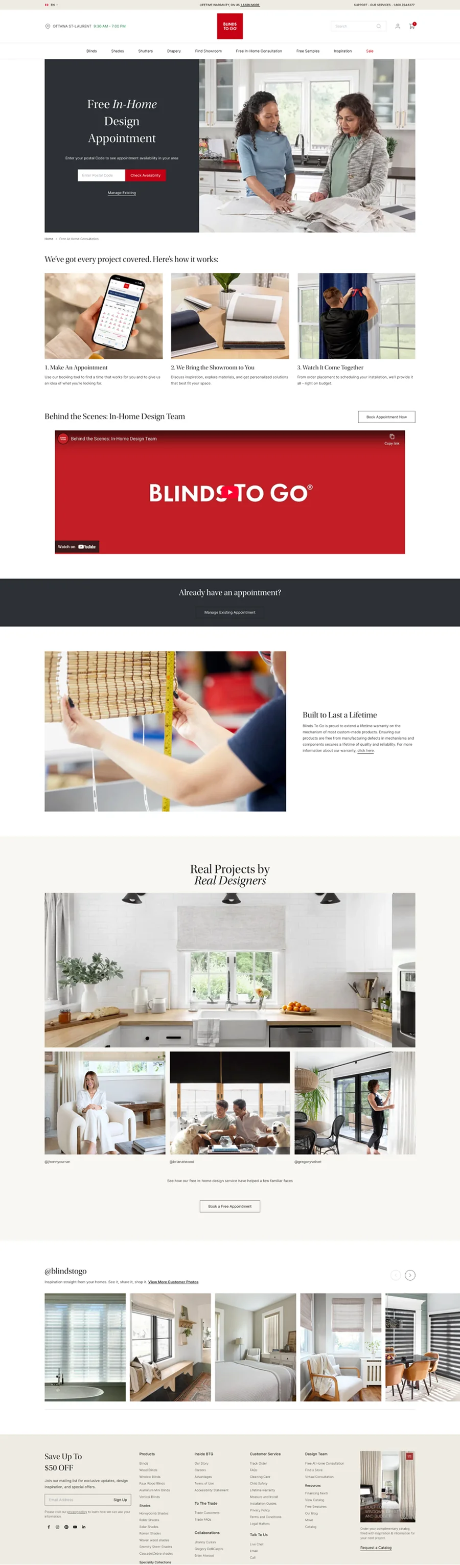
One editorial hero, one zip-code field, a clear three-step strip, and a “Real Projects by Real Designers” gallery as proof.
“There's a lot here — I'm not sure what the first thing to do is.”Before · usability session
“I just enter my zip code and book — and I can see the kind of work they actually do.”After · usability session
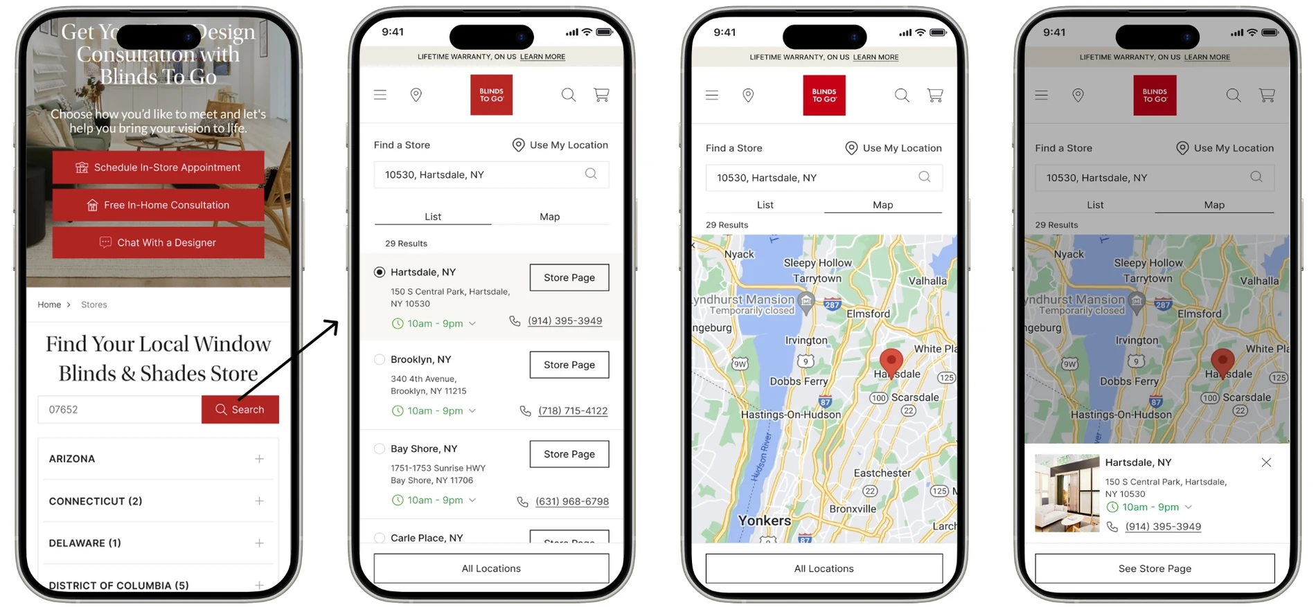
Find a Showroom
Finding a store meant scanning a long, text-only list grouped by state. The redesign turns each location into a card a shopper can recognize — a real photo, distance, address, and two clear actions: Plan Your Visit or Call to Schedule. Drag the handle to compare.
Drag the divider to move between the original list view and the redesigned photo-card view.
“I don't know which store is right for me.”Before · usability session
“I can quickly pick the best location and take action.”After · usability session
Mobile Navigation
On mobile the menu mirrored the desktop information architecture — long and product-first. I reorganized it around what people come to do, surfaced booking actions to the top, added a persistent “Need Help?” chat entry, and simplified “My Account” to an icon with the missing Order Status path restored — so the next step is always one tap away.
With the menu reprioritized around intent, I designed the store-finder it leads into as a single continuous flow. A shopper moves from the consultation hero straight into search, then chooses how they want to browse — a scannable list with hours and tap-to-call numbers, or an interactive map — and lands on a selected-store card with one obvious next step. Every screen carries exactly one primary action, so the path from “I need blinds” to “I’m booked” never stalls.
“I have to figure out where to go.”Before · usability session
“I immediately know what to do.”After · usability session
Booking
End to end
The appointment-scheduling flow tied the three entry points together. I collapsed a cluttered multi-screen form into a calm, three-step path — find a time, enter contact details, confirm — with a visible progress indicator the whole way.
Choose how to shop
Shop at Home, Find a Showroom, or Get Expert Help.
Find a time
Pick a date and slot from a clear weekly calendar.
Enter details
One short contact form, zip-code prefilled.
Confirm
A reassuring summary and reference number.
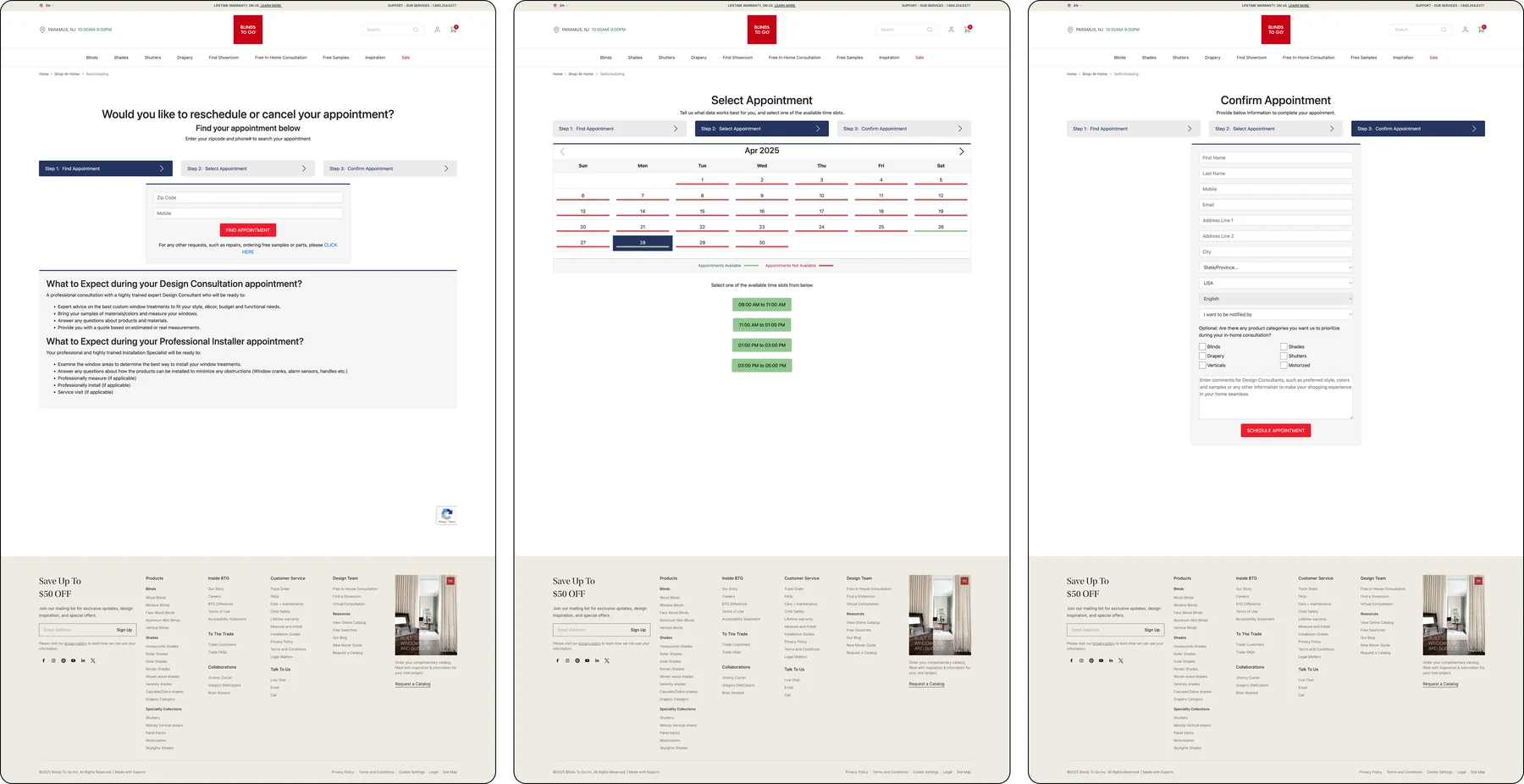
Heavy forms and long instructional copy on every step.
A clean time grid, one compact form, and a friendly confirmation.
Design system · interactive
A retail system, built in Figma like an enterprise would.
Three flows can only stay consistent if the parts underneath them are shared. I built “Cornerstone” — a tokenized Figma library on a 12-column grid, documented in Zeroheight and synced to Storybook with Token Studio. Switch layers to explore it.
Brand palette
BTG Red anchors action; a warm neutral ramp carries surfaces and text. Color is defined once at the token layer and inherited — never re-picked per page.
Type scale
An editorial serif display sits over a clean sans body — a 1.2 modular scale tuned for retail headlines and dense store data alike.
Tokens & layout grid
Spacing, radius, and color live as Token Studio variables — the contract between Figma and engineering. Everything composes onto a 12-column desktop grid and a 4-column mobile grid.
12-column reference grid · 32px gutters — every editorial hero and store-card row aligns to the same rhythm.
Component set
The real, adoptable parts behind every flow — modelled on the live Blinds To Go UI: red action buttons, the promo banner, retail trust badges, the zip search, and a recognizable store card. Each ships with documented states.
Documented in Zeroheight, tokenized with Token Studio, and mirrored in Storybook — so the editorial team could update seasonal campaigns from shared components instead of one-off pages.
Results
Clarity the business could measure.
The +42% conversion and 30% faster completion figures come from the client's instrumented funnel analytics, comparing the 60 days post-launch against the prior 60-day baseline for the redesigned flows. Performance gains (8× page loads) were measured in Lighthouse and field data; the 95% campaign-update reduction reflects the editorial team's time-on-task before and after the tokenized template system. Qualitative quotes are drawn from moderated usability sessions run during validation.
Marketing pushed hard to keep the promotional carousel on the redesigned Shop-at-Home page — it was a known revenue surface. Testing showed it was also the thing burying the booking action. Rather than win the argument by opinion, I shipped an A/B variant: the carousel-free layout converted higher on the booking intent, and we relocated promos to a lower band instead of cutting them. The lesson that stuck: align on the success metric before the layout debate, and let the funnel referee.
Reflection
Key takeaways
Lead with the question, not the page
Each flow improved the moment it answered one real shopper question with one obvious action.
Show proof, not just promise
Real designer projects and recognizable store photos did more for trust than another row of copy.
A grid is a conversion lever
A shared 12-column grid and token set kept three flows consistent and let the team ship far faster.
Fewer steps, more confidence
Collapsing the booking form into three clear steps cut friction and lifted completion.